FabCon is coming to Atlanta
Join us at FabCon Atlanta from March 16 - 20, 2026, for the ultimate Fabric, Power BI, AI and SQL community-led event. Save $200 with code FABCOMM.
Register now!The Power BI Data Visualization World Championships is back! Get ahead of the game and start preparing now! Learn more
- Power BI forums
- Issues
- Issues
- Y axis formatting - percentage issue
- Subscribe to RSS Feed
- Mark as New
- Mark as Read
- Bookmark
- Subscribe
- Printer Friendly Page
- Report Inappropriate Content
Y axis formatting - percentage issue
Hello,
I have strange situation with Y axis formatting on line chart. Report contains metric as following:
Main Metric = DIVIDE( [Nominator $], [Denominator $], BLANK() )
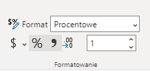
Main Metric was formatted in the following way:
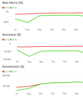
There are following line charts. In this example all Y-axises are formatted correctly.
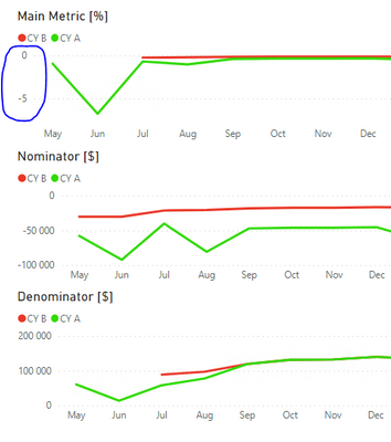
The issue is visible if user select wider time range and Denominator equals BLANK for some months. Then Y-axis for Main Metric is formatted in incorrect way (as a Whole Number, not as Percentage).
I understand that Main Metric for CY B on May and Jun equals BLANK because of Divide by blank. However, I don't understand why Y-axis shows Whole Number instead of Percentage.
You must be a registered user to add a comment. If you've already registered, sign in. Otherwise, register and sign in.
- YacAaz on: Combo chart - custom data label for line chart not...
- kevinlewis56 on: Request for PL-300 Exam Voucher Extension Due to H...
-
 Hongju_Jung
on:
Translation Issue in the Korean Version
- Nameless_LW on: Unable to find latest powerbi gateway STANDARD MOD...
- djordje369 on: Installing an update from template app fails
-
 Hongju_Jung
on:
A Typo about Visual Gridline in the View menu (Kor...
- jake18 on: Fix High Vulnerabilities found in On-Prem Data Gat...
- BI_Tiffin on: Power BI Azure Map - Connecticut Geocoding Ambigui...
-
acig
 on:
Issue with new card visual - reference labels spac...
- catsamson on: Issues with new card visual displaying an URL imag...
- New 8,246
- Needs Info 3,502
- Investigating 3,602
- Accepted 2,089
- Declined 38
- Delivered 3,975
-
Reports
10,355 -
Data Modeling
4,192 -
Dashboards
4,147 -
Report Server
2,131 -
Gateways
2,130 -
APIS and Embedding
1,981 -
Custom Visuals
1,808 -
Content Packs
528 -
Mobile
354 -
Need Help
12 -
General Comment
7 -
Show and Tell
3 -
Tips and Tricks
2 -
Power BI Desktop
1


Hi @kamilp,
I’ve tested based on the description but couldn’t reproduce this issue. What’s the version of your Desktop? Is it the latest version? If you try older versions, will you also see this issue?
Best Regards,
Community Support Team _ Caiyun