FabCon is coming to Atlanta
Join us at FabCon Atlanta from March 16 - 20, 2026, for the ultimate Fabric, Power BI, AI and SQL community-led event. Save $200 with code FABCOMM.
Register now!- Power BI forums
- Get Help with Power BI
- Desktop
- Service
- Report Server
- Power Query
- Mobile Apps
- Developer
- DAX Commands and Tips
- Custom Visuals Development Discussion
- Health and Life Sciences
- Power BI Spanish forums
- Translated Spanish Desktop
- Training and Consulting
- Instructor Led Training
- Dashboard in a Day for Women, by Women
- Galleries
- Data Stories Gallery
- Themes Gallery
- Contests Gallery
- QuickViz Gallery
- Quick Measures Gallery
- Visual Calculations Gallery
- Notebook Gallery
- Translytical Task Flow Gallery
- TMDL Gallery
- R Script Showcase
- Webinars and Video Gallery
- Ideas
- Custom Visuals Ideas (read-only)
- Issues
- Issues
- Events
- Upcoming Events
Get Fabric Certified for FREE during Fabric Data Days. Don't miss your chance! Request now
- Power BI forums
- Issues
- Issues
- Y axis formatting - percentage issue
- Subscribe to RSS Feed
- Mark as New
- Mark as Read
- Bookmark
- Subscribe
- Printer Friendly Page
- Report Inappropriate Content
Y axis formatting - percentage issue
Hello,
I have strange situation with Y axis formatting on line chart. Report contains metric as following:
Main Metric = DIVIDE( [Nominator $], [Denominator $], BLANK() )
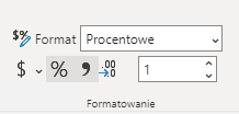
Main Metric was formatted in the following way:
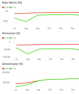
There are following line charts. In this example all Y-axises are formatted correctly.
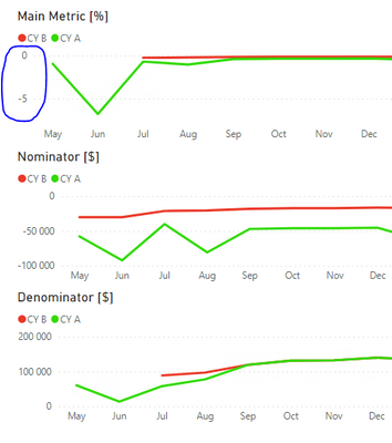
The issue is visible if user select wider time range and Denominator equals BLANK for some months. Then Y-axis for Main Metric is formatted in incorrect way (as a Whole Number, not as Percentage).
I understand that Main Metric for CY B on May and Jun equals BLANK because of Divide by blank. However, I don't understand why Y-axis shows Whole Number instead of Percentage.
You must be a registered user to add a comment. If you've already registered, sign in. Otherwise, register and sign in.
-
 mattlee
on:
Issue with new card visual - reference labels spac...
- catsamson on: Issues with new card visual displaying an URL imag...
-
 mattlee
on:
Image in New Card Visual (incorrect size)
-
 mattlee
on:
Issue with new card visual after publishing to PBI...
- tejaswi_464 on: DataFormat.Error: There were more columns in the r...
-
Ian_Stuart_Rupe
 on:
Issue with Card Visual Layout After November Power...
- Murzao on: Bug Report: Unable to send dataflow refresh failur...
- mb123_ on: Bug in sorting - Gantt 3.4.2.0 from Microsoft
-
DNMAF
 on:
Adding a measure or column as a tooltip to an Azur...
- Kevin_Wells81 on: Measure creation in Power BI Desktop is extremely ...
- New 8,204
- Needs Info 3,502
- Investigating 3,602
- Accepted 2,089
- Declined 38
- Delivered 3,976
-
Reports
10,333 -
Data Modeling
4,184 -
Dashboards
4,140 -
Gateways
2,127 -
Report Server
2,126 -
APIS and Embedding
1,978 -
Custom Visuals
1,806 -
Content Packs
527 -
Mobile
355 -
Need Help
11 -
General Comment
4 -
Show and Tell
3 -
Tips and Tricks
1 -
Power BI Desktop
1


Hi @kamilp,
I’ve tested based on the description but couldn’t reproduce this issue. What’s the version of your Desktop? Is it the latest version? If you try older versions, will you also see this issue?
Best Regards,
Community Support Team _ Caiyun