Join us at the 2025 Microsoft Fabric Community Conference
March 31 - April 2, 2025, in Las Vegas, Nevada. Use code MSCUST for a $150 discount! Early bird discount ends December 31.
Register Now- Power BI forums
- Get Help with Power BI
- Desktop
- Service
- Report Server
- Power Query
- Mobile Apps
- Developer
- DAX Commands and Tips
- Custom Visuals Development Discussion
- Health and Life Sciences
- Power BI Spanish forums
- Translated Spanish Desktop
- Training and Consulting
- Instructor Led Training
- Dashboard in a Day for Women, by Women
- Galleries
- Community Connections & How-To Videos
- COVID-19 Data Stories Gallery
- Themes Gallery
- Data Stories Gallery
- R Script Showcase
- Webinars and Video Gallery
- Quick Measures Gallery
- 2021 MSBizAppsSummit Gallery
- 2020 MSBizAppsSummit Gallery
- 2019 MSBizAppsSummit Gallery
- Events
- Ideas
- Custom Visuals Ideas
- Issues
- Issues
- Events
- Upcoming Events
Be one of the first to start using Fabric Databases. View on-demand sessions with database experts and the Microsoft product team to learn just how easy it is to get started. Watch now
- Power BI forums
- Issues
- Issues
- Distortion on the X-Axis when graph is pinned to d...
- Subscribe to RSS Feed
- Mark as New
- Mark as Read
- Bookmark
- Subscribe
- Printer Friendly Page
- Report Inappropriate Content
Distortion on the X-Axis when graph is pinned to dashboard
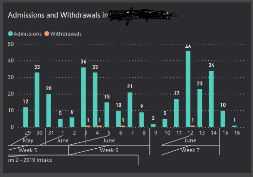
I have a clustered barchart with the x-axis containing three fully-expanded levels, as shown below.
This looks normal when viewed as a report on Power BI Service. However, when it is pinned to a dashboard the x-axis will sometimes mis-align, as shown in the second visual.
The problem occurs consistently when the dashboard is accessed through the Power BI mobile app. When accessed through a desktop browser, it occurs about 3 times out of 10.
This is annoying  . I suspect a bug in the dashboard visualisation.
Help, anyone?
You must be a registered user to add a comment. If you've already registered, sign in. Otherwise, register and sign in.
-
 v-xiaoyan-msft
on:
Unable to Add Calculated Columns to hybrid tables
-
 v-xiaoyan-msft
on:
Incremental Refresh giving Expression.Error: There...
-
 v-xiaoyan-msft
on:
Erro ao buscar os dados para este visual
- TheNoMoreHero on: Unable to start a new notebook session, unless it ...
-
 v-xiaoyan-msft
on:
Arranging 'Show data point as table' for all value...
-
 v-xiaoyan-msft
on:
Created a duplicate table in Tabular Editor and tr...
- alanzzera on: Error rendering the report
- RoyCalex on: Unable to access the powerbi apps with Semantic mo...
-
 v-xiaoyan-msft
on:
Incorrect value shows in table, and duplicate row ...
-
 v-xiaoyan-msft
on:
Unable to save project on My Files
- New 7,840
- Needs Info 3,500
- Investigating 3,464
- Accepted 2,077
- Declined 38
- Delivered 3,942
-
Reports
10,042 -
Dashboards
4,048 -
Data Modeling
4,047 -
Gateways
2,090 -
Report Server
2,083 -
APIS and Embedding
1,935 -
Custom Visuals
1,746 -
Content Packs
516 -
Mobile
352 -
Need Help
11 -
Show and Tell
3 -
General Comment
2 -
Tips and Tricks
1 -
Power BI Desktop
1

