New Offer! Become a Certified Fabric Data Engineer
Check your eligibility for this 50% exam voucher offer and join us for free live learning sessions to get prepared for Exam DP-700.
Get Started- Power BI forums
- Get Help with Power BI
- Desktop
- Service
- Report Server
- Power Query
- Mobile Apps
- Developer
- DAX Commands and Tips
- Custom Visuals Development Discussion
- Health and Life Sciences
- Power BI Spanish forums
- Translated Spanish Desktop
- Training and Consulting
- Instructor Led Training
- Dashboard in a Day for Women, by Women
- Galleries
- Community Connections & How-To Videos
- COVID-19 Data Stories Gallery
- Themes Gallery
- Data Stories Gallery
- R Script Showcase
- Webinars and Video Gallery
- Quick Measures Gallery
- 2021 MSBizAppsSummit Gallery
- 2020 MSBizAppsSummit Gallery
- 2019 MSBizAppsSummit Gallery
- Events
- Ideas
- Custom Visuals Ideas
- Issues
- Issues
- Events
- Upcoming Events
Don't miss out! 2025 Microsoft Fabric Community Conference, March 31 - April 2, Las Vegas, Nevada. Use code MSCUST for a $150 discount. Prices go up February 11th. Register now.
- Power BI forums
- Issues
- Issues
- Distortion on the X-Axis when graph is pinned to d...
- Subscribe to RSS Feed
- Mark as New
- Mark as Read
- Bookmark
- Subscribe
- Printer Friendly Page
- Report Inappropriate Content
Distortion on the X-Axis when graph is pinned to dashboard
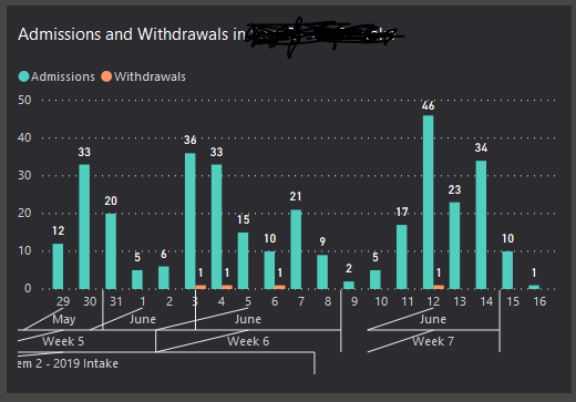
I have a clustered barchart with the x-axis containing three fully-expanded levels, as shown below.
This looks normal when viewed as a report on Power BI Service. However, when it is pinned to a dashboard the x-axis will sometimes mis-align, as shown in the second visual.
The problem occurs consistently when the dashboard is accessed through the Power BI mobile app. When accessed through a desktop browser, it occurs about 3 times out of 10.
This is annoying  . I suspect a bug in the dashboard visualisation.
Help, anyone?
You must be a registered user to add a comment. If you've already registered, sign in. Otherwise, register and sign in.
-
nleuck_101
 on:
Issues with calculating previous day using Date ta...
- dangelo1 on: Bug report
-
 v-jtian-msft
on:
appsource.microsoft.com refused to connect.
- MarkB63 on: Allow table columns in matrices values area.
-
 v-xiaoyan-msft
on:
"Structural Change" errors resulting from Enhanced...
-
 v-xiaoyan-msft
on:
Please remove the New Idea submission from this fo...
- Hensku on: Timeline 2.4.0 Slicer Labels Displaying Unexpected...
- VAMI on: Issue publishing report does not replace existing ...
-
nleuck_101
 on:
Dataverse tables not showing up in Power BI
-
andyclap
 on:
Fix export to excel from visual.
- New 7,842
- Needs Info 3,500
- Investigating 3,490
- Accepted 2,077
- Declined 38
- Delivered 3,949
-
Reports
10,060 -
Dashboards
4,054 -
Data Modeling
4,054 -
Gateways
2,091 -
Report Server
2,089 -
APIS and Embedding
1,935 -
Custom Visuals
1,751 -
Content Packs
517 -
Mobile
352 -
Need Help
11 -
Show and Tell
3 -
General Comment
2 -
Power BI Desktop
1 -
Tips and Tricks
1

