Hi,
Have had an issue with the bullet chart visual for a short while - I've sized a couple of visuals to display normally in the desktop, I can even reduce the height a small amount within the desktop if I wanted to and everything fits onto the visual fine. When I publish to the service however, the visual is rendered somewhat differently, the axis labels seem larger and there appears to be increased padding at the top of the visual, which is forcing a scroll bar onto the visual:
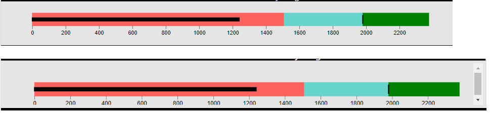
Top image is the visual as displayed in desktop, the bottom is as in the service.
Using September 2019 desktop and version 2.0.1 of the visual in question. I cannot actually see any options within the desktop to actually amend the padding within the visual/axis text sizing so I'm confused as to how they can change in the service?

 on:
app.powerbi.com down?
on:
app.powerbi.com down?
 DataZoe
on:
Set as landing page feature missing in Apr 2026 up...
DataZoe
on:
Set as landing page feature missing in Apr 2026 up...
 on:
Template App "Microsoft 365 Usage Analytics" faili...
on:
Template App "Microsoft 365 Usage Analytics" faili...