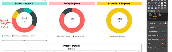
I am using a Ring Chart to show a count of Process Impacts effecting a group of projects. As more Process Impacts are added to the data, the chart updates with those new Impacts and assigns new default colors. That is all fine expect that I want to avoid a certain color from ever being used when my charts are refreshed with updated data. Adding a function to either "lock" a set of colors to be used or specify a color(s) to not be used, would be very helpful on 'count' visuals that will change on refresh.
If anyone has a suggestion for a different visual to use, for my particular situation, I would love to hear it.

 on:
app.powerbi.com down?
on:
app.powerbi.com down?
 DataZoe
on:
Set as landing page feature missing in Apr 2026 up...
DataZoe
on:
Set as landing page feature missing in Apr 2026 up...
 on:
Template App "Microsoft 365 Usage Analytics" faili...
on:
Template App "Microsoft 365 Usage Analytics" faili...