Get Fabric certified for FREE!
Don't miss your chance to take the Fabric Data Engineer (DP-600) exam for FREE! Find out how by watching the DP-600 session on-demand now through April 28th.
Learn more- Power BI forums
- Get Help with Power BI
- Desktop
- Service
- Report Server
- Power Query
- Mobile Apps
- Developer
- DAX Commands and Tips
- Custom Visuals Development Discussion
- Health and Life Sciences
- Power BI Spanish forums
- Translated Spanish Desktop
- Training and Consulting
- Instructor Led Training
- Dashboard in a Day for Women, by Women
- Galleries
- Data Stories Gallery
- Themes Gallery
- Contests Gallery
- QuickViz Gallery
- Quick Measures Gallery
- Visual Calculations Gallery
- Notebook Gallery
- Translytical Task Flow Gallery
- TMDL Gallery
- R Script Showcase
- Webinars and Video Gallery
- Ideas
- Custom Visuals Ideas (read-only)
- Issues
- Issues
- Events
- Upcoming Events
Join the FabCon + SQLCon recap series. Up next: Power BI, Real-Time Intelligence, IQ and AI, and Data Factory take center stage. All sessions are available on-demand after the live show. Register now
- Power BI forums
- Issues
- Issues
- PowerPoint Export Changes Legend Layout
- Subscribe to RSS Feed
- Mark as New
- Mark as Read
- Bookmark
- Subscribe
- Printer Friendly Page
- Report Inappropriate Content
PowerPoint Export Changes Legend Layout
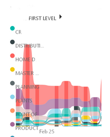
This was working fine yesterday but today when I exported the online Power BI report to PowerPoint, the legend (which usually resides along the top of this chart) has mysteriously moved to be left-aligned, and covering the charts. This is on every chart & page in my report, so it's not just a single page. I have not changed this report recently.
- « Previous
-
- 1
- 2
- 3
- Next »
- « Previous
-
- 1
- 2
- 3
- Next »
You must be a registered user to add a comment. If you've already registered, sign in. Otherwise, register and sign in.
- alisonmoraes on: Usuário PPU Sem acesso
-
 mattlee
on:
Small multiples not fitting to scale
- Chandanu14 on: AADSTS50011: Fabric MCP Redirect URI missing from ...
- DanArcher on: Unknown Error on Close & Apply
-
vgeldbr
 on:
Connection Timeout to Azure Analysis Services (AAS...
- zjd4atcdc on: CMD Prompt Popping Up During Changes
-
 mattlee
on:
Problem : Data labels stacked bar chart
-
 mattlee
on:
Previously working Mac calender visual now gives m...
-
 DataZoe
on:
Subject: Regression – Synchronized axis ranges no ...
- chadmkelly on: Power BI Desktop Refresh Issue
- New 8,347
- Needs Info 3,502
- Investigating 3,603
- Accepted 2,094
- Declined 38
- Delivered 3,983
-
Reports
10,412 -
Data Modeling
4,217 -
Dashboards
4,174 -
Report Server
2,139 -
Gateways
2,133 -
APIS and Embedding
1,992 -
Custom Visuals
1,823 -
Content Packs
532 -
Mobile
354 -
Need Help
13 -
General Comment
7 -
Show and Tell
3 -
Tips and Tricks
2 -
Power BI Desktop
1
