A new Data Days event is coming soon!
This time we’re going bigger than ever. Fabric, Power BI, SQL, AI and more. We're covering it all. You won't want to miss it.
Learn moreGo To
- Power BI forums
- Get Help with Power BI
- Desktop
- Service
- Report Server
- Power Query
- Mobile Apps
- Developer
- DAX Commands and Tips
- Custom Visuals Development Discussion
- Health and Life Sciences
- Power BI Spanish forums
- Translated Spanish Desktop
- Training and Consulting
- Instructor Led Training
- Dashboard in a Day for Women, by Women
- Galleries
- Data Stories Gallery
- Themes Gallery
- Contests Gallery
- QuickViz Gallery
- Quick Measures Gallery
- Visual Calculations Gallery
- Notebook Gallery
- Translytical Task Flow Gallery
- TMDL Gallery
- R Script Showcase
- Webinars and Video Gallery
- Ideas
- Custom Visuals Ideas (read-only)
- Issues
- Issues
- Events
- Upcoming Events
Turn on suggestions
Auto-suggest helps you quickly narrow down your search results by suggesting possible matches as you type.
Showing results for
Level up your Power BI skills this month - build one visual each week and tell better stories with data! Get started
- Power BI forums
- Issues
- Issues
- PowerPoint Export Changes Legend Layout
Idea Options
- Subscribe to RSS Feed
- Mark as New
- Mark as Read
- Bookmark
- Subscribe
- Printer Friendly Page
- Report Inappropriate Content
PowerPoint Export Changes Legend Layout
Submitted by
Anonymous
on
03-29-2018
12:51 PM
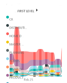
This was working fine yesterday but today when I exported the online Power BI report to PowerPoint, the legend (which usually resides along the top of this chart) has mysteriously moved to be left-aligned, and covering the charts. This is on every chart & page in my report, so it's not just a single page. I have not changed this report recently.
See more ideas labeled with:
Comments
- « Previous
-
- 1
- 2
- 3
- Next »
- « Previous
-
- 1
- 2
- 3
- Next »
You must be a registered user to add a comment. If you've already registered, sign in. Otherwise, register and sign in.
Latest Comments
- YossiRozenman on: No able to access Microsoft UI String Search page
-
 mattlee
on:
Input Text Slicer Broken on PBI Services
-
 mattlee
on:
Input Slicer Bug: Cursor jumps to position 0 and v...
-
 mattlee
on:
Input Slicer Causing Browser Tab Freeze in Public ...
- alisonmoraes on: Usuário PPU Sem acesso
-
 mattlee
on:
Small multiples not fitting to scale
- Chandanu14 on: AADSTS50011: Fabric MCP Redirect URI missing from ...
- DanArcher on: Unknown Error on Close & Apply
-
vgeldbr
 on:
Connection Timeout to Azure Analysis Services (AAS...
-
burakdemirtas
 on:
CMD Prompt Popping Up During Changes
Idea Statuses
- New 8,360
- Needs Info 3,502
- Investigating 3,603
- Accepted 2,096
- Declined 38
- Delivered 3,984
-
Reports
10,423 -
Data Modeling
4,220 -
Dashboards
4,176 -
Report Server
2,142 -
Gateways
2,135 -
APIS and Embedding
1,993 -
Custom Visuals
1,823 -
Content Packs
532 -
Mobile
354 -
Need Help
13 -
General Comment
7 -
Show and Tell
3 -
Tips and Tricks
2 -
Power BI Desktop
1
