Join us at the 2025 Microsoft Fabric Community Conference
March 31 - April 2, 2025, in Las Vegas, Nevada. Use code MSCUST for a $150 discount! Early bird discount ends December 31.
Register Now- Power BI forums
- Get Help with Power BI
- Desktop
- Service
- Report Server
- Power Query
- Mobile Apps
- Developer
- DAX Commands and Tips
- Custom Visuals Development Discussion
- Health and Life Sciences
- Power BI Spanish forums
- Translated Spanish Desktop
- Training and Consulting
- Instructor Led Training
- Dashboard in a Day for Women, by Women
- Galleries
- Community Connections & How-To Videos
- COVID-19 Data Stories Gallery
- Themes Gallery
- Data Stories Gallery
- R Script Showcase
- Webinars and Video Gallery
- Quick Measures Gallery
- 2021 MSBizAppsSummit Gallery
- 2020 MSBizAppsSummit Gallery
- 2019 MSBizAppsSummit Gallery
- Events
- Ideas
- Custom Visuals Ideas
- Issues
- Issues
- Events
- Upcoming Events
Be one of the first to start using Fabric Databases. View on-demand sessions with database experts and the Microsoft product team to learn just how easy it is to get started. Watch now
- Power BI forums
- Issues
- Issues
- New graph feature "Series labels" is not showing a...
- Subscribe to RSS Feed
- Mark as New
- Mark as Read
- Bookmark
- Subscribe
- Printer Friendly Page
- Report Inappropriate Content
New graph feature "Series labels" is not showing all series
I recently found the new addition of "series labels" and I think it looks amazing! Sadly I encountered an issue with it.
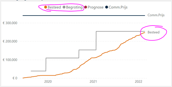
I found that when two series end up near the same point, one gets overruled by the other and doesn't get shown.
In this example "Besteed" (spent) and "begroting" (budget) end up near the same point. The series label "besteed" is shown, but "begroting" is not. A possible solution for this example is to put the series on the left side, but then the same issue will happen when series start at the same point.
Please change it so that both are shown, because there is plenty of space!
Here is an example of another project where the issue does not happen:
Sincerely,
Erik
- « Previous
-
- 1
- 2
- Next »
- « Previous
-
- 1
- 2
- Next »
You must be a registered user to add a comment. If you've already registered, sign in. Otherwise, register and sign in.
-
 v-xiaoyan-msft
on:
Error rendering the report
- RoyCalex on: Unable to access the powerbi apps with Semantic mo...
-
 v-xiaoyan-msft
on:
Incorrect value shows in table, and duplicate row ...
-
 v-xiaoyan-msft
on:
Unable to save project on My Files
-
 v-xiaoyan-msft
on:
Fix Dataflow Gen1 Referenced Entities in Downstrea...
-
 v-xiaoyan-msft
on:
Issue on MAP visual
-
 v-xiaoyan-msft
on:
Failed to update Source Credentials PBi Service
- Damiensize on: Lakehouse table error : Encountered Azure error wh...
- ku_kim on: Connect Partitioned table in Fabric Lakehouse to P...
-
 v-xiaoyan-msft
on:
Issue: unable to load word cloud
- New 7,842
- Needs Info 3,500
- Investigating 3,459
- Accepted 2,077
- Declined 38
- Delivered 3,941
-
Reports
10,041 -
Dashboards
4,047 -
Data Modeling
4,044 -
Gateways
2,090 -
Report Server
2,082 -
APIS and Embedding
1,935 -
Custom Visuals
1,746 -
Content Packs
516 -
Mobile
352 -
Need Help
11 -
Show and Tell
3 -
General Comment
2 -
Tips and Tricks
1 -
Power BI Desktop
1


Hi @Anonymous ,
There is an enhancement on this feature, but no expected available time currently. Please be patient for the fix. And the workaround for now is adding a “Sort by column” to the field in the Legend field or re-arrange the measures in the Values field if one is preferred over another since the winner of series label is the last one rendered.
Best Regards,
Community Support Team _ Caiyun