Get Fabric certified for FREE!
Don't miss your chance to take the Fabric Data Engineer (DP-600) exam for FREE! Find out how by watching the DP-600 session on-demand now through April 28th.
Learn more- Power BI forums
- Get Help with Power BI
- Desktop
- Service
- Report Server
- Power Query
- Mobile Apps
- Developer
- DAX Commands and Tips
- Custom Visuals Development Discussion
- Health and Life Sciences
- Power BI Spanish forums
- Translated Spanish Desktop
- Training and Consulting
- Instructor Led Training
- Dashboard in a Day for Women, by Women
- Galleries
- Data Stories Gallery
- Themes Gallery
- Contests Gallery
- QuickViz Gallery
- Quick Measures Gallery
- Visual Calculations Gallery
- Notebook Gallery
- Translytical Task Flow Gallery
- TMDL Gallery
- R Script Showcase
- Webinars and Video Gallery
- Ideas
- Custom Visuals Ideas (read-only)
- Issues
- Issues
- Events
- Upcoming Events
Join the FabCon + SQLCon recap series. Up next: Power BI, Real-Time Intelligence, IQ and AI, and Data Factory take center stage. All sessions are available on-demand after the live show. Register now
- Power BI forums
- Issues
- Issues
- Issue: Difference in Line Chart visualization betw...
- Subscribe to RSS Feed
- Mark as New
- Mark as Read
- Bookmark
- Subscribe
- Printer Friendly Page
- Report Inappropriate Content
Issue: Difference in Line Chart visualization between Power BI Desktop and app.powerbi.com
I am having some issues with the Line Chart visual in Power BI. The trouble is that there is a difference between how the graph is displayed in Power BI Desktop and app.powerbi.com.
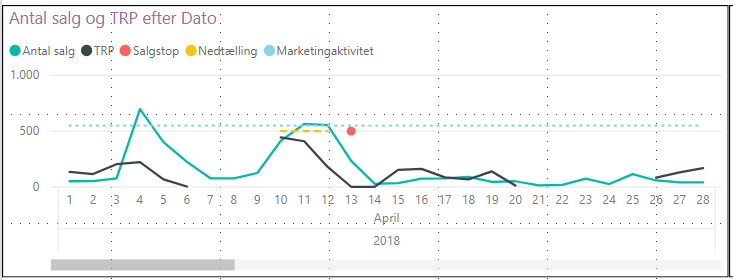
In Power BI Desktop my Line Chart the black line is disjointed when there are days with no data (this is what I want it to look like).
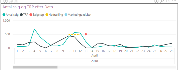
However, when uploading the report to app.powerbi.com the black line is no longer disjointed.
See below images:


Many thanks beforehand for fixing this!
You must be a registered user to add a comment. If you've already registered, sign in. Otherwise, register and sign in.
- alisonmoraes on: Usuário PPU Sem acesso
-
 mattlee
on:
Small multiples not fitting to scale
- Chandanu14 on: AADSTS50011: Fabric MCP Redirect URI missing from ...
- DanArcher on: Unknown Error on Close & Apply
-
vgeldbr
 on:
Connection Timeout to Azure Analysis Services (AAS...
- zjd4atcdc on: CMD Prompt Popping Up During Changes
-
 mattlee
on:
Problem : Data labels stacked bar chart
-
 mattlee
on:
Previously working Mac calender visual now gives m...
-
 DataZoe
on:
Subject: Regression – Synchronized axis ranges no ...
- chadmkelly on: Power BI Desktop Refresh Issue
- New 8,346
- Needs Info 3,502
- Investigating 3,603
- Accepted 2,094
- Declined 38
- Delivered 3,983
-
Reports
10,411 -
Data Modeling
4,217 -
Dashboards
4,174 -
Report Server
2,139 -
Gateways
2,133 -
APIS and Embedding
1,992 -
Custom Visuals
1,823 -
Content Packs
532 -
Mobile
354 -
Need Help
13 -
General Comment
7 -
Show and Tell
3 -
Tips and Tricks
2 -
Power BI Desktop
1