Join the #PBI10 DataViz contest
Power BI is turning 10, and we’re marking the occasion with a special community challenge. Use your creativity to tell a story, uncover trends, or highlight something unexpected.
Get startedGo To
- Power BI forums
- Get Help with Power BI
- Desktop
- Service
- Report Server
- Power Query
- Mobile Apps
- Developer
- DAX Commands and Tips
- Custom Visuals Development Discussion
- Health and Life Sciences
- Power BI Spanish forums
- Translated Spanish Desktop
- Training and Consulting
- Instructor Led Training
- Dashboard in a Day for Women, by Women
- Galleries
- Webinars and Video Gallery
- Data Stories Gallery
- Themes Gallery
- Contests Gallery
- Quick Measures Gallery
- Notebook Gallery
- Translytical Task Flow Gallery
- R Script Showcase
- Ideas
- Custom Visuals Ideas (read-only)
- Issues
- Issues
- Events
- Upcoming Events
Turn on suggestions
Auto-suggest helps you quickly narrow down your search results by suggesting possible matches as you type.
Showing results for
Join us for an expert-led overview of the tools and concepts you'll need to become a Certified Power BI Data Analyst and pass exam PL-300. Register now.
- Power BI forums
- Issues
- Issues
- Correlation Plot in Deneb
Idea Options
- Subscribe to RSS Feed
- Mark as New
- Mark as Read
- Bookmark
- Subscribe
- Printer Friendly Page
- Report Inappropriate Content
0
Correlation Plot in Deneb
Submitted by
JimmyCruyp
 on
02-23-2023
10:42 AM
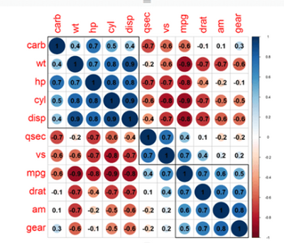
Does anyone know where I can find the code to create the correlation graph which was on the store in R and which is no longer there? In Vega or Vega lite for Deneb? Thank you so much.
See more ideas labeled with:
Comments
- « Previous
-
- 1
- 2
- Next »
- « Previous
-
- 1
- 2
- Next »
You must be a registered user to add a comment. If you've already registered, sign in. Otherwise, register and sign in.
Latest Comments
-
 mattlee
on:
“Add Value” in Textbox Not Visible in Dark Theme
- mattin on: Report Server Permissions Jan/May 2025
-
bhalicki
 on:
Bi Crashes on launch with (AS Process PID=XXXXXX H...
- stanteitelbaum on: authenticator wont trigger after purchase of new p...
-
Stinkys
 on:
Fix the Date function in DAX
-
Stinkys
 on:
Cannot login to community site
-
reubwork
 on:
May 25 update for Snowflake Connector v2 has broke...
-
dmkblesser
 on:
Unable to open existing PBIP files
- DamoUK on: Gateway issues
- davidebacci on: Total Labels not following dynamic formatting rule...
Idea Statuses
- New 8,007
- Needs Info 3,502
- Investigating 3,602
- Accepted 2,088
- Declined 38
- Delivered 3,970
-
Reports
10,223 -
Data Modeling
4,127 -
Dashboards
4,110 -
Report Server
2,113 -
Gateways
2,112 -
APIS and Embedding
1,963 -
Custom Visuals
1,785 -
Content Packs
523 -
Mobile
354 -
Need Help
11 -
Show and Tell
3 -
General Comment
2 -
Tips and Tricks
1 -
Power BI Desktop
1
