Fabric Data Days starts November 4th!
Advance your Data & AI career with 50 days of live learning, dataviz contests, hands-on challenges, study groups & certifications and more!
Get registered- Power BI forums
- Get Help with Power BI
- Desktop
- Service
- Report Server
- Power Query
- Mobile Apps
- Developer
- DAX Commands and Tips
- Custom Visuals Development Discussion
- Health and Life Sciences
- Power BI Spanish forums
- Translated Spanish Desktop
- Training and Consulting
- Instructor Led Training
- Dashboard in a Day for Women, by Women
- Galleries
- Data Stories Gallery
- Themes Gallery
- Contests Gallery
- QuickViz Gallery
- Quick Measures Gallery
- Visual Calculations Gallery
- Notebook Gallery
- Translytical Task Flow Gallery
- TMDL Gallery
- R Script Showcase
- Webinars and Video Gallery
- Ideas
- Custom Visuals Ideas (read-only)
- Issues
- Issues
- Events
- Upcoming Events
Get Fabric Certified for FREE during Fabric Data Days. Don't miss your chance! Request now
- Power BI forums
- Issues
- Issues
- Copy as image with caption: bottom of visual cut o...
- Subscribe to RSS Feed
- Mark as New
- Mark as Read
- Bookmark
- Subscribe
- Printer Friendly Page
- Report Inappropriate Content
Copy as image with caption: bottom of visual cut off
For some visuals, the bottom of the visual is cut off when using the Copy as image with caption feature form Power BI service.
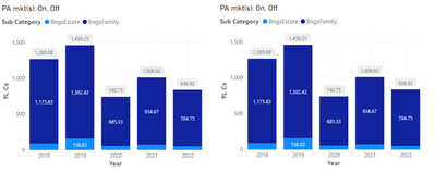
In the screenshot below, there are two pretty simple bar chart visuals. Both visuals are identical in every way. Same pizel dimensions, same data & measures for the axis & legend, same formatting options applied. I've reviewed every option/attribute for the two visuals in Power BI Desktop (March '23 edition) and cannot determine any difference of any kind (except for the position on the page). Below you see the two identical visuals, rendered in the Power BI service. Of course, it would be quite difficult to show that everything between the two is identical in the Desktop authoring environment; please take my word that I've checked every single thing.
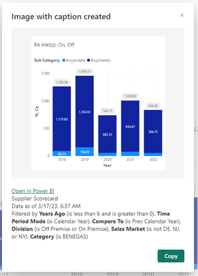
However, when I click the Copy as image with caption icon on the left visual, the result is this below. Notice the y-axis labels are a different scale than what thsi visual itself displays, and, more importantly, the bottom of the visual is missing - the lower half of the 2nd column's data label is cut off and the x-axis categories and label (the years themselves and the label 'Year') are missing. When pasted into something (such as a Word doc, for example), the pasted image is identical to that displayed in the screenshot - e.g. the pasted image and caption is rendered with the errors exactly as shown in the 'popup'.
Clicking the same icon, Copy as image with caption, this time on the right visual, displays almost exactly as the visual is displayed in the report. The y-axis labels are the same as what is displayed on the report page itself, the data labels in the bottom of the columns are not cut off (this is the one difference between the visual; as rendered on the report page and how it is rendered when copied as image with caption - notice there is a data label for the lower portion in the first column, whereas in the first screenshot, showing the two side-by-side identical visuals, there is not), and the x-axis categories (the years) and the label ('Year') are displayed as expected - as they are on the visual on the report.
I cannot determine ANY difference between the left and right 'versions' of the visuals, yet they yield very different results when utilizing the copy as image with caption feature.
Thoughts or suggestions? If there are any clarifying questions, please do let me know.
- « Previous
-
- 1
- 2
- 3
- Next »
- « Previous
-
- 1
- 2
- 3
- Next »
You must be a registered user to add a comment. If you've already registered, sign in. Otherwise, register and sign in.
- SandiellyOrtega on: Image in New Card Visual (incorrect size)
-
DouweMeer
 on:
Issue with new card visual after publishing to PBI...
- tejaswi_464 on: DataFormat.Error: There were more columns in the r...
- NinaGrace on: Issue with Card Visual Layout After November Power...
- Murzao on: Bug Report: Unable to send dataflow refresh failur...
- mb123_ on: Bug in sorting - Gantt 3.4.2.0 from Microsoft
-
DNMAF
 on:
Adding a measure or column as a tooltip to an Azur...
- Kevin_Wells81 on: Measure creation in Power BI Desktop is extremely ...
-
 parry2k
on:
A Typo about Refence Line in the Format (Korean)
- ricardo_ona on: UDFs annotations Issue with Invoke-ProcessASDataba...
- New 8,204
- Needs Info 3,502
- Investigating 3,603
- Accepted 2,088
- Declined 38
- Delivered 3,974
-
Reports
10,332 -
Data Modeling
4,183 -
Dashboards
4,140 -
Gateways
2,127 -
Report Server
2,126 -
APIS and Embedding
1,978 -
Custom Visuals
1,805 -
Content Packs
527 -
Mobile
355 -
Need Help
11 -
General Comment
4 -
Show and Tell
3 -
Power BI Desktop
1 -
Tips and Tricks
1


