- Subscribe to RSS Feed
- Mark as New
- Mark as Read
- Bookmark
- Subscribe
- Printer Friendly Page
- Report Inappropriate Content
Copy as image with caption: bottom of visual cut off
For some visuals, the bottom of the visual is cut off when using the Copy as image with caption feature form Power BI service.
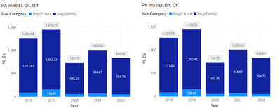
In the screenshot below, there are two pretty simple bar chart visuals. Both visuals are identical in every way. Same pizel dimensions, same data & measures for the axis & legend, same formatting options applied. I've reviewed every option/attribute for the two visuals in Power BI Desktop (March '23 edition) and cannot determine any difference of any kind (except for the position on the page). Below you see the two identical visuals, rendered in the Power BI service. Of course, it would be quite difficult to show that everything between the two is identical in the Desktop authoring environment; please take my word that I've checked every single thing.
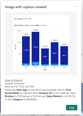
However, when I click the Copy as image with caption icon on the left visual, the result is this below. Notice the y-axis labels are a different scale than what thsi visual itself displays, and, more importantly, the bottom of the visual is missing - the lower half of the 2nd column's data label is cut off and the x-axis categories and label (the years themselves and the label 'Year') are missing. When pasted into something (such as a Word doc, for example), the pasted image is identical to that displayed in the screenshot - e.g. the pasted image and caption is rendered with the errors exactly as shown in the 'popup'.
Clicking the same icon, Copy as image with caption, this time on the right visual, displays almost exactly as the visual is displayed in the report. The y-axis labels are the same as what is displayed on the report page itself, the data labels in the bottom of the columns are not cut off (this is the one difference between the visual; as rendered on the report page and how it is rendered when copied as image with caption - notice there is a data label for the lower portion in the first column, whereas in the first screenshot, showing the two side-by-side identical visuals, there is not), and the x-axis categories (the years) and the label ('Year') are displayed as expected - as they are on the visual on the report.
I cannot determine ANY difference between the left and right 'versions' of the visuals, yet they yield very different results when utilizing the copy as image with caption feature.
Thoughts or suggestions? If there are any clarifying questions, please do let me know.
 Investigating
v-xiaoyan-msft (Community Support) responded
- « Previous
-
- 1
- 2
- 3
- Next »
- « Previous
-
- 1
- 2
- 3
- Next »
You must be a registered user to add a comment. If you've already registered, sign in. Otherwise, register and sign in.
-
 smpa01
on:
We couldn't load your datamart
- BecC on: Turned off Callout Values in Card (New) Visual sti...
- catsamson on: SVG Image URL in Card (New) Visual is not working ...
- marvindo on: New Card Visual inadvertently switching on values ...
- Heather_Schramm on: Copying Table with Filters is Ignoring Filters
- DNilsson on: March 2025 Update - Error fetching data for this v...
-
 AnGanjam
on:
Snowflake connector isn't showing views after Marc...
-
 mattlee
on:
March 2025 update - Style preset error
- Eder_JG on: Conditional Formatting - Field Value not working a...
- jbongjbong on: Stretched App's Logo in Home Page "Recommended"
- New 7,881
- Needs Info 3,502
- Investigating 3,603
- Accepted 2,084
- Declined 38
- Delivered 3,964
-
Reports
10,154 -
Data Modeling
4,094 -
Dashboards
4,084 -
Gateways
2,103 -
Report Server
2,100 -
APIS and Embedding
1,951 -
Custom Visuals
1,772 -
Content Packs
521 -
Mobile
353 -
Need Help
11 -
Show and Tell
3 -
General Comment
2 -
Tips and Tricks
1 -
Power BI Desktop
1


Hi @rfonash_vntg ,
Please check the screenshot of my test below, I wasn't able to reproduce your problem. Is there a problem with my reproduction steps, can you provide a sample pbix or a detailed reproduction step? (Please be careful not to include sensitive information)
My test browser :MS Edge
Best regards.
Community Support Team_ Caitlyn