Join the #PBI10 DataViz contest
Power BI is turning 10, and we’re marking the occasion with a special community challenge. Use your creativity to tell a story, uncover trends, or highlight something unexpected.
Get started- Power BI forums
- Get Help with Power BI
- Desktop
- Service
- Report Server
- Power Query
- Mobile Apps
- Developer
- DAX Commands and Tips
- Custom Visuals Development Discussion
- Health and Life Sciences
- Power BI Spanish forums
- Translated Spanish Desktop
- Training and Consulting
- Instructor Led Training
- Dashboard in a Day for Women, by Women
- Galleries
- Webinars and Video Gallery
- Data Stories Gallery
- Themes Gallery
- Contests Gallery
- Quick Measures Gallery
- Notebook Gallery
- Translytical Task Flow Gallery
- R Script Showcase
- Ideas
- Custom Visuals Ideas (read-only)
- Issues
- Issues
- Events
- Upcoming Events
Join us for an expert-led overview of the tools and concepts you'll need to become a Certified Power BI Data Analyst and pass exam PL-300. Register now.
- Power BI forums
- Issues
- Issues
- Bug: Small multiples breaks shared y axis on line ...
- Subscribe to RSS Feed
- Mark as New
- Mark as Read
- Bookmark
- Subscribe
- Printer Friendly Page
- Report Inappropriate Content
Bug: Small multiples breaks shared y axis on line and clustered column chart
In the line and clustered column chart and line and stacked column chart visuals, there is the option to use two measures, and view them displayed on either one or two y axis.
On basic, single-measure visuals where small multiples are used, the y axis can synchronise across the differnt small measures using the 'shared y axis' option in the visual options.
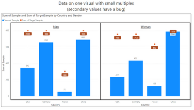
The issue is that when the two-measure visuals try to use small multiples, the y axis do not work properly. The secondary measure will not be taken into account when the axis range is designed.
I'm guessing that this is the result of the small multiples feature for these charts not having the axis designed to use the highest of all values. The range of the shared y-axis is determined entirely by the primary measure used, and not by the full range of both of the primary and secondary.
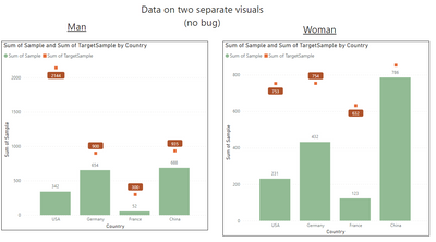
I have prepared an example pbix and visuals (fake data). As you can see, the y axis cuts out at the 800 mark, when it should go up to above 2000. The problem occurs regardless of whether the small multiple panes are vertically or horizontally aligned.
Compare this to how the data looks if it was shown on two seperate visuals
The Target value for Man-USA is very high, but in the first picture (blue columns) , the number is displayed correctly on the tooltip but the marker is too low.
You must be a registered user to add a comment. If you've already registered, sign in. Otherwise, register and sign in.
-
 mattlee
on:
“Add Value” in Textbox Not Visible in Dark Theme
- mattin on: Report Server Permissions Jan/May 2025
-
bhalicki
 on:
Bi Crashes on launch with (AS Process PID=XXXXXX H...
- stanteitelbaum on: authenticator wont trigger after purchase of new p...
-
Stinkys
 on:
Fix the Date function in DAX
-
Stinkys
 on:
Cannot login to community site
-
reubwork
 on:
May 25 update for Snowflake Connector v2 has broke...
-
dmkblesser
 on:
Unable to open existing PBIP files
- DamoUK on: Gateway issues
- davidebacci on: Total Labels not following dynamic formatting rule...
- New 8,008
- Needs Info 3,502
- Investigating 3,602
- Accepted 2,088
- Declined 38
- Delivered 3,970
-
Reports
10,224 -
Data Modeling
4,127 -
Dashboards
4,110 -
Report Server
2,113 -
Gateways
2,112 -
APIS and Embedding
1,963 -
Custom Visuals
1,785 -
Content Packs
523 -
Mobile
354 -
Need Help
11 -
Show and Tell
3 -
General Comment
2 -
Tips and Tricks
1 -
Power BI Desktop
1

