FabCon is coming to Atlanta
Join us at FabCon Atlanta from March 16 - 20, 2026, for the ultimate Fabric, Power BI, AI and SQL community-led event. Save $200 with code FABCOMM.
Register now!- Power BI forums
- Get Help with Power BI
- Desktop
- Service
- Report Server
- Power Query
- Mobile Apps
- Developer
- DAX Commands and Tips
- Custom Visuals Development Discussion
- Health and Life Sciences
- Power BI Spanish forums
- Translated Spanish Desktop
- Training and Consulting
- Instructor Led Training
- Dashboard in a Day for Women, by Women
- Galleries
- Data Stories Gallery
- Themes Gallery
- Contests Gallery
- QuickViz Gallery
- Quick Measures Gallery
- Visual Calculations Gallery
- Notebook Gallery
- Translytical Task Flow Gallery
- TMDL Gallery
- R Script Showcase
- Webinars and Video Gallery
- Ideas
- Custom Visuals Ideas (read-only)
- Issues
- Issues
- Events
- Upcoming Events
Get Fabric Certified for FREE during Fabric Data Days. Don't miss your chance! Request now
- Power BI forums
- Issues
- Issues
- Bubbles on scatter chart are truncated
- Subscribe to RSS Feed
- Mark as New
- Mark as Read
- Bookmark
- Subscribe
- Printer Friendly Page
- Report Inappropriate Content
Bubbles on scatter chart are truncated
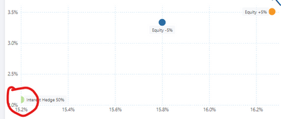
When you have a scatter chart with auto scaling and one of the bubbles happens to be near the edge of the chart, then part of this bubble is truncated. See example below:
This looks bad, particularly when the size of the bubble is set somewhat bigger (f.e. 24 points as in example below).
Expected behaviour: the auto scaling takes into account the size of the bubble, so it will not be truncated.
PS: this may seem to be an edge case, but in fact happens quite often if the number of observations in the scatter chart is relatively low. Which is exaclty the use case in which you typically want to use a large bubble size.
You must be a registered user to add a comment. If you've already registered, sign in. Otherwise, register and sign in.
- BI_Tiffin on: Power BI Azure Map - Connecticut Geocoding Ambigui...
-
acig
 on:
Issue with new card visual - reference labels spac...
- catsamson on: Issues with new card visual displaying an URL imag...
- Shackleton on: Image in New Card Visual (incorrect size)
-
 mattlee
on:
Issue with new card visual after publishing to PBI...
- tejaswi_464 on: DataFormat.Error: There were more columns in the r...
-
Ian_Stuart_Rupe
 on:
Issue with Card Visual Layout After November Power...
- Murzao on: Bug Report: Unable to send dataflow refresh failur...
- mb123_ on: Bug in sorting - Gantt 3.4.2.0 from Microsoft
-
DNMAF
 on:
Adding a measure or column as a tooltip to an Azur...
- New 8,217
- Needs Info 3,502
- Investigating 3,602
- Accepted 2,089
- Declined 38
- Delivered 3,976
-
Reports
10,339 -
Data Modeling
4,187 -
Dashboards
4,144 -
Gateways
2,127 -
Report Server
2,126 -
APIS and Embedding
1,979 -
Custom Visuals
1,806 -
Content Packs
528 -
Mobile
355 -
Need Help
11 -
General Comment
6 -
Show and Tell
3 -
Tips and Tricks
2 -
Power BI Desktop
1
