Fabric Data Days starts November 4th!
Advance your Data & AI career with 50 days of live learning, dataviz contests, hands-on challenges, study groups & certifications and more!
Get registered- Power BI forums
- Get Help with Power BI
- Desktop
- Service
- Report Server
- Power Query
- Mobile Apps
- Developer
- DAX Commands and Tips
- Custom Visuals Development Discussion
- Health and Life Sciences
- Power BI Spanish forums
- Translated Spanish Desktop
- Training and Consulting
- Instructor Led Training
- Dashboard in a Day for Women, by Women
- Galleries
- Data Stories Gallery
- Themes Gallery
- Contests Gallery
- QuickViz Gallery
- Quick Measures Gallery
- Visual Calculations Gallery
- Notebook Gallery
- Translytical Task Flow Gallery
- TMDL Gallery
- R Script Showcase
- Webinars and Video Gallery
- Ideas
- Custom Visuals Ideas (read-only)
- Issues
- Issues
- Events
- Upcoming Events
Get Fabric Certified for FREE during Fabric Data Days. Don't miss your chance! Request now
- Power BI forums
- Issues
- Issues
- X-axis title cut off when using zoom slider
- Subscribe to RSS Feed
- Mark as New
- Mark as Read
- Bookmark
- Subscribe
- Printer Friendly Page
- Report Inappropriate Content
X-axis title cut off when using zoom slider
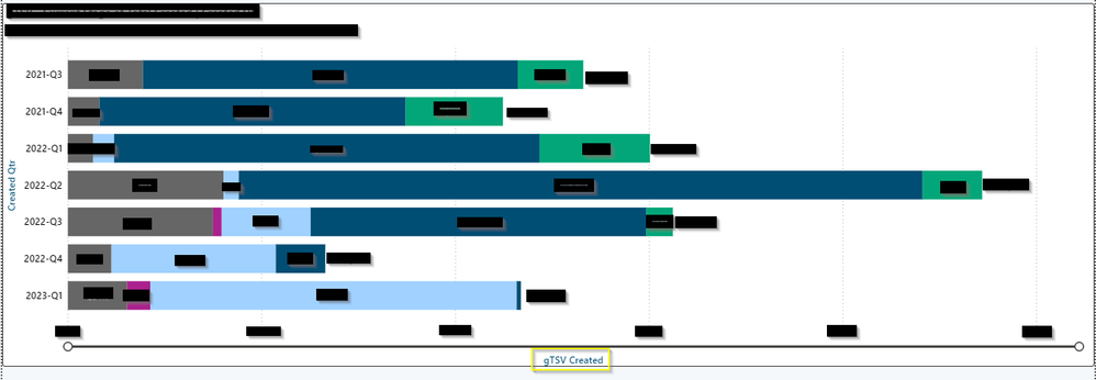
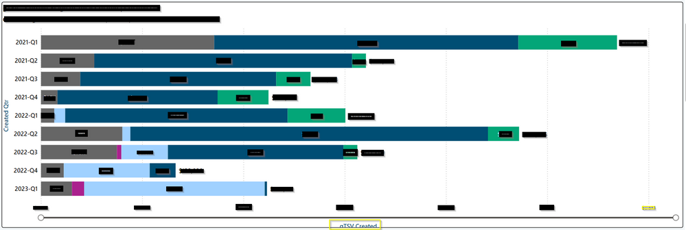
I have an issue with an X-axis title in a horizontal stacked bar chart. It looks fine in the Power BI Desktop but is cut off when viewing the chart online. It seems to be due to the zoom slider cutting off the X-axis title in the online report.
I've attached images to show what I mean. The first image is the desktop viewe of the chart correctly showing the X-axis title. The second image is the same chart in the online view with the X-axis title cut off. I highlighted the X-axis title in yellow in each image.
(numbers in the images were manually blacked out for privacy)
Please let me know if you need more details to diagnose the issue, thanks!


You must be a registered user to add a comment. If you've already registered, sign in. Otherwise, register and sign in.
- tejaswi_464 on: DataFormat.Error: There were more columns in the r...
-
 DataZoe
on:
Issue with Card Visual Layout After November Power...
- Murzao on: Bug Report: Unable to send dataflow refresh failur...
- mb123_ on: Bug in sorting - Gantt 3.4.2.0 from Microsoft
-
DNMAF
 on:
Adding a measure or column as a tooltip to an Azur...
- Kevin_Wells81 on: Measure creation in Power BI Desktop is extremely ...
-
 parry2k
on:
A Typo about Refence Line in the Format (Korean)
- ricardo_ona on: UDFs annotations Issue with Invoke-ProcessASDataba...
- DeeBaxo on: Export to PowerBI directly from Sharepoint List
-
 mattlee
on:
Automatically expand table columns to fill availab...
- New 8,197
- Needs Info 3,502
- Investigating 3,603
- Accepted 2,088
- Declined 38
- Delivered 3,974
-
Reports
10,325 -
Data Modeling
4,183 -
Dashboards
4,137 -
Gateways
2,127 -
Report Server
2,125 -
APIS and Embedding
1,978 -
Custom Visuals
1,805 -
Content Packs
527 -
Mobile
355 -
Need Help
11 -
General Comment
4 -
Show and Tell
3 -
Power BI Desktop
1 -
Tips and Tricks
1