Fabric Data Days starts November 4th!
Advance your Data & AI career with 50 days of live learning, dataviz contests, hands-on challenges, study groups & certifications and more!
Get registered- Power BI forums
- Get Help with Power BI
- Desktop
- Service
- Report Server
- Power Query
- Mobile Apps
- Developer
- DAX Commands and Tips
- Custom Visuals Development Discussion
- Health and Life Sciences
- Power BI Spanish forums
- Translated Spanish Desktop
- Training and Consulting
- Instructor Led Training
- Dashboard in a Day for Women, by Women
- Galleries
- Data Stories Gallery
- Themes Gallery
- Contests Gallery
- Quick Measures Gallery
- Visual Calculations Gallery
- Notebook Gallery
- Translytical Task Flow Gallery
- TMDL Gallery
- R Script Showcase
- Webinars and Video Gallery
- Ideas
- Custom Visuals Ideas (read-only)
- Issues
- Issues
- Events
- Upcoming Events
Join us at FabCon Atlanta from March 16 - 20, 2026, for the ultimate Fabric, Power BI, AI and SQL community-led event. Save $200 with code FABCOMM. Register now.
- Power BI forums
- Issues
- Issues
- X-axis sort order breaks when adding legend in sca...
- Subscribe to RSS Feed
- Mark as New
- Mark as Read
- Bookmark
- Subscribe
- Printer Friendly Page
- Report Inappropriate Content
X-axis sort order breaks when adding legend in scatter chart
Hi there,
I'm trying to use a scatter chart with a categorical x-axis (i.e. it's more of a dot-plot than a scatter chart). I have sorted the values in my x-axis by an "order" column like below:
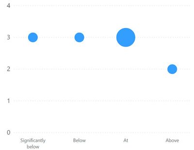
When I apply it to the x-axis on my scatter chart, it's fine:
However, when I add certain fields as a legend to that chart, the order sometimes becomes out of whack somehow:
Does anyone know why this may be happening?
Thanks,
Ed
You must be a registered user to add a comment. If you've already registered, sign in. Otherwise, register and sign in.
- Ghoom on: Azure Maps Controls -> Selection Greyed out
- RobSt on: Error:Visuals display blank when export report to ...
-
hb380
 on:
New Button Slicer: Issue with the Grid type of Arr...
-
 mattlee
on:
List Slicer Button Dimensions Ignored in Service
-
bhalicki
 on:
BUG: report connected to deleted semantic model ca...
- Annamarie on: PBI Semantic Model missing
- SeanGTB on: Azure Map visual auto zoom issue with 3D columns
- Ghoom on: Azure map bubble chart is very blurry
-
JoshT
 on:
Deployment pipelines don't support M365 groups
-
 Hongju_Jung
on:
A Typo about Measure tools (Korean)
- New 8,149
- Needs Info 3,502
- Investigating 3,602
- Accepted 2,090
- Declined 38
- Delivered 3,970
-
Reports
10,297 -
Data Modeling
4,170 -
Dashboards
4,129 -
Gateways
2,123 -
Report Server
2,123 -
APIS and Embedding
1,975 -
Custom Visuals
1,800 -
Content Packs
527 -
Mobile
355 -
Need Help
11 -
Show and Tell
3 -
General Comment
3 -
Tips and Tricks
1 -
Power BI Desktop
1


