Fabric Data Days starts November 4th!
Advance your Data & AI career with 50 days of live learning, dataviz contests, hands-on challenges, study groups & certifications and more!
Get registered- Power BI forums
- Get Help with Power BI
- Desktop
- Service
- Report Server
- Power Query
- Mobile Apps
- Developer
- DAX Commands and Tips
- Custom Visuals Development Discussion
- Health and Life Sciences
- Power BI Spanish forums
- Translated Spanish Desktop
- Training and Consulting
- Instructor Led Training
- Dashboard in a Day for Women, by Women
- Galleries
- Data Stories Gallery
- Themes Gallery
- Contests Gallery
- QuickViz Gallery
- Quick Measures Gallery
- Visual Calculations Gallery
- Notebook Gallery
- Translytical Task Flow Gallery
- TMDL Gallery
- R Script Showcase
- Webinars and Video Gallery
- Ideas
- Custom Visuals Ideas (read-only)
- Issues
- Issues
- Events
- Upcoming Events
Get Fabric Certified for FREE during Fabric Data Days. Don't miss your chance! Request now
- Power BI forums
- Issues
- Issues
- Weird Date Format on Clustered Column Chart X-Axis
- Subscribe to RSS Feed
- Mark as New
- Mark as Read
- Bookmark
- Subscribe
- Printer Friendly Page
- Report Inappropriate Content
Weird Date Format on Clustered Column Chart X-Axis
Hi there,
I have encountered some weird formatting in the PBI Service, that is not occurring in the desktop application.
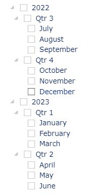
In one of my reports, I have a clustered column chart with date (type: continuous) along the X-Axis and a date list slicer for years, quarters and months. The date format on the chart when the slicer is unfiltered, or when a year or quarter is selected, is 'MMM YYYY' as expected.
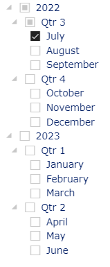
However, when I select a single month from the date list slicer, the format is inconsistent - sometimes it is 'MMM YYYY' but other times, it is 'DD MMM hh:mm', or sometimes 'YYYY' only.
Something appears to have gone awry with the interaction at the month level. Please may you investigate?
Default slicer & chart x-axis format:
Slicer month selection & updated x-axis (Service ONLY):
You must be a registered user to add a comment. If you've already registered, sign in. Otherwise, register and sign in.
-
DNMAF
 on:
Adding a measure or column as a tooltip to an Azur...
-
 parry2k
on:
A Typo about Refence Line in the Format (Korean)
- ricardo_ona on: UDFs annotations Issue with Invoke-ProcessASDataba...
- DeeBaxo on: Export to PowerBI directly from Sharepoint List
-
 mattlee
on:
Automatically expand table columns to fill availab...
- Ghoom on: Azure Maps Controls -> Selection Greyed out
-
awright19
 on:
Open old report, PowerBi hangs
-
 mattlee
on:
Error:Visuals display blank when export report to ...
-
 mattlee
on:
New Button Slicer: Issue with the Grid type of Arr...
-
 mattlee
on:
List Slicer Button Dimensions Ignored in Service
- New 8,182
- Needs Info 3,502
- Investigating 3,602
- Accepted 2,089
- Declined 38
- Delivered 3,973
-
Reports
10,314 -
Data Modeling
4,178 -
Dashboards
4,134 -
Gateways
2,127 -
Report Server
2,124 -
APIS and Embedding
1,977 -
Custom Visuals
1,805 -
Content Packs
527 -
Mobile
355 -
Need Help
11 -
General Comment
4 -
Show and Tell
3 -
Tips and Tricks
1 -
Power BI Desktop
1


