FabCon is coming to Atlanta
Join us at FabCon Atlanta from March 16 - 20, 2026, for the ultimate Fabric, Power BI, AI and SQL community-led event. Save $200 with code FABCOMM.
Register now!Go To
- Power BI forums
- Get Help with Power BI
- Desktop
- Service
- Report Server
- Power Query
- Mobile Apps
- Developer
- DAX Commands and Tips
- Custom Visuals Development Discussion
- Health and Life Sciences
- Power BI Spanish forums
- Translated Spanish Desktop
- Training and Consulting
- Instructor Led Training
- Dashboard in a Day for Women, by Women
- Galleries
- Data Stories Gallery
- Themes Gallery
- Contests Gallery
- QuickViz Gallery
- Quick Measures Gallery
- Visual Calculations Gallery
- Notebook Gallery
- Translytical Task Flow Gallery
- TMDL Gallery
- R Script Showcase
- Webinars and Video Gallery
- Ideas
- Custom Visuals Ideas (read-only)
- Issues
- Issues
- Events
- Upcoming Events
Turn on suggestions
Auto-suggest helps you quickly narrow down your search results by suggesting possible matches as you type.
Showing results for
Get Fabric Certified for FREE during Fabric Data Days. Don't miss your chance! Request now
- Power BI forums
- Issues
- Issues
- Series Data Colors Changing Upon Publish
Idea Options
- Subscribe to RSS Feed
- Mark as New
- Mark as Read
- Bookmark
- Subscribe
- Printer Friendly Page
- Report Inappropriate Content
Series Data Colors Changing Upon Publish
Submitted by
ebeery
 on
07-19-2022
02:07 PM
Hello,
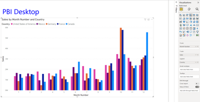
I'm experience a bug where data series colors in cluster bar charts, pie charts, etc. are changing (seemingly at random) upon publishing into the Service.
Sometimes the colors are simply switched around, other times Power BI actually assigns two series values to the same color.
Below is an example, created using the sample "Financials" dataset.
See more ideas labeled with:
Comments
You must be a registered user to add a comment. If you've already registered, sign in. Otherwise, register and sign in.
Latest Comments
- jake18 on: Fix High Vulnerabilities found in On-Prem Data Gat...
- BI_Tiffin on: Power BI Azure Map - Connecticut Geocoding Ambigui...
-
acig
 on:
Issue with new card visual - reference labels spac...
- catsamson on: Issues with new card visual displaying an URL imag...
- Shackleton on: Image in New Card Visual (incorrect size)
-
 mattlee
on:
Issue with new card visual after publishing to PBI...
- tejaswi_464 on: DataFormat.Error: There were more columns in the r...
- Mesalomee on: Issue with Card Visual Layout After November Power...
- Murzao on: Bug Report: Unable to send dataflow refresh failur...
- mb123_ on: Bug in sorting - Gantt 3.4.2.0 from Microsoft
Idea Statuses
- New 8,220
- Needs Info 3,502
- Investigating 3,602
- Accepted 2,089
- Declined 38
- Delivered 3,976
-
Reports
10,341 -
Data Modeling
4,187 -
Dashboards
4,145 -
Gateways
2,128 -
Report Server
2,126 -
APIS and Embedding
1,980 -
Custom Visuals
1,806 -
Content Packs
528 -
Mobile
355 -
Need Help
11 -
General Comment
6 -
Show and Tell
3 -
Tips and Tricks
2 -
Power BI Desktop
1


Currently this is by design, and is something we're looking at changing.
See: Change the color of all data points
There are certain circumstances where Power BI will change the legend (and data) colors. One example is when your visual is created using streaming data, a new month begins, and a new category is introduced into your visual. Let's say that you've set the data colors for all five categories in the line chart above. And now it's Jan-13 and another manufacturer has entered the market. Because you did not set a data color for that new manufacturer, you may find that Power BI has changed the data colors for the original five manufacturers. When a new category is introduced, you may have to reassign data colors to the new and existing categories using the Formatting > Data colors pane.
Best Regards,
Community Support Team _ Yingjie Li