FabCon is coming to Atlanta
Join us at FabCon Atlanta from March 16 - 20, 2026, for the ultimate Fabric, Power BI, AI and SQL community-led event. Save $200 with code FABCOMM.
Register now!Go To
- Power BI forums
- Get Help with Power BI
- Desktop
- Service
- Report Server
- Power Query
- Mobile Apps
- Developer
- DAX Commands and Tips
- Custom Visuals Development Discussion
- Health and Life Sciences
- Power BI Spanish forums
- Translated Spanish Desktop
- Training and Consulting
- Instructor Led Training
- Dashboard in a Day for Women, by Women
- Galleries
- Data Stories Gallery
- Themes Gallery
- Contests Gallery
- Quick Measures Gallery
- Notebook Gallery
- Translytical Task Flow Gallery
- TMDL Gallery
- R Script Showcase
- Webinars and Video Gallery
- Ideas
- Custom Visuals Ideas (read-only)
- Issues
- Issues
- Events
- Upcoming Events
Turn on suggestions
Auto-suggest helps you quickly narrow down your search results by suggesting possible matches as you type.
Showing results for
Calling all Data Engineers! Fabric Data Engineer (Exam DP-700) live sessions are back! Starting October 16th. Sign up.
- Power BI forums
- Issues
- Issues
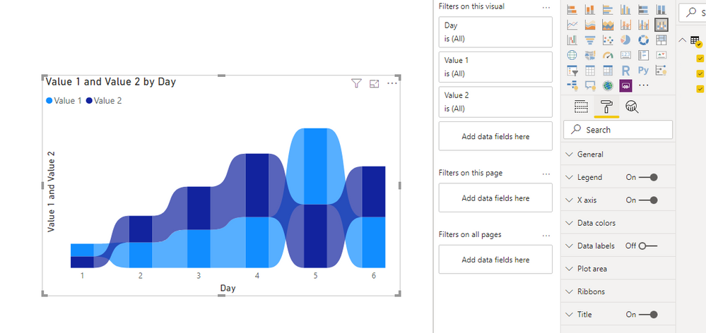
- Ribbon Chart has no Y axis control
Idea Options
- Subscribe to RSS Feed
- Mark as New
- Mark as Read
- Bookmark
- Subscribe
- Printer Friendly Page
- Report Inappropriate Content
Ribbon Chart has no Y axis control
Submitted by
 wynhopkins
on
01-23-2020
01:08 AM
The Ribbon Chart has no Y axis formatting option. So the only way to turn off the Y Axis Title is to convert it to a column chart, turn off the Y axis label and then change back to a Ribbon Chart
See more ideas labeled with:
Comments
You must be a registered user to add a comment. If you've already registered, sign in. Otherwise, register and sign in.
Latest Comments
- EsmereldaK on: List Slicer Button Dimensions Ignored in Service
-
JoshT
 on:
BUG: report connected to deleted semantic model ca...
- Annamarie on: PBI Semantic Model missing
-
JoshT
 on:
Deployment pipelines don't support M365 groups
- jwulffraat on: In the Power BI web version, the left border canno...
- Pig1838 on: DirectQuery not available anymore in Incremental r...
- DataMindedLLC on: 'Refresh Preview' gone from Home Menu Bar in Aug 2...
- qutnd on: Issue with giving Power BI App access to new users
- Sree9100822653 on: undefinedHow to send daily RLS-based Power BI repo...
- Bart_Berg on: Export Data to Excel from powerbi embed reports | ...
Idea Statuses
- New 8,138
- Needs Info 3,502
- Investigating 3,602
- Accepted 2,088
- Declined 38
- Delivered 3,970
-
Reports
10,290 -
Data Modeling
4,164 -
Dashboards
4,129 -
Report Server
2,123 -
Gateways
2,122 -
APIS and Embedding
1,974 -
Custom Visuals
1,797 -
Content Packs
527 -
Mobile
355 -
Need Help
11 -
Show and Tell
3 -
General Comment
3 -
Tips and Tricks
1 -
Power BI Desktop
1
