Become a Certified Power BI Data Analyst!
Join us for an expert-led overview of the tools and concepts you'll need to pass exam PL-300. The first session starts on June 11th. See you there!
Get registered- Power BI forums
- Get Help with Power BI
- Desktop
- Service
- Report Server
- Power Query
- Mobile Apps
- Developer
- DAX Commands and Tips
- Custom Visuals Development Discussion
- Health and Life Sciences
- Power BI Spanish forums
- Translated Spanish Desktop
- Training and Consulting
- Instructor Led Training
- Dashboard in a Day for Women, by Women
- Galleries
- Webinars and Video Gallery
- Data Stories Gallery
- Themes Gallery
- Contests Gallery
- Quick Measures Gallery
- Notebook Gallery
- Translytical Task Flow Gallery
- R Script Showcase
- Ideas
- Custom Visuals Ideas (read-only)
- Issues
- Issues
- Events
- Upcoming Events
Power BI is turning 10! Let’s celebrate together with dataviz contests, interactive sessions, and giveaways. Register now.
- Power BI forums
- Issues
- Issues
- Recent PBI Service Update: Visual Titles now have ...
- Subscribe to RSS Feed
- Mark as New
- Mark as Read
- Bookmark
- Subscribe
- Printer Friendly Page
- Report Inappropriate Content
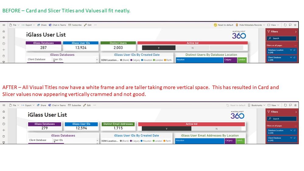
Recent PBI Service Update: Visual Titles now have white frame and are taller; info below is squished
Anyone else experiencing this? The formatting of the visual titles in my report was all good.
Now it is not good any more. There are white frames around the Titles making them taller. Plus, even without these white frames, the Titles themselves are taller. This is causing the information below (i.e. Card Data Labels) to be crammed/squished. The Cards now look mediocre and the Slicer looks terrible.
There was some Power BI Service update late last week that caused this. Below snapshots show BEFORE and AFTER. Such a small change is causing basically all the cards in all my reports to look squished and not good.
- « Previous
-
- 1
- 2
- 3
- Next »
- « Previous
-
- 1
- 2
- 3
- Next »
You must be a registered user to add a comment. If you've already registered, sign in. Otherwise, register and sign in.
-
 mattlee
on:
“Add Value” in Textbox Not Visible in Dark Theme
- mattin on: Report Server Permissions Jan/May 2025
-
bhalicki
 on:
Bi Crashes on launch with (AS Process PID=XXXXXX H...
- stanteitelbaum on: authenticator wont trigger after purchase of new p...
-
Stinkys
 on:
Fix the Date function in DAX
-
Stinkys
 on:
Cannot login to community site
-
reubwork
 on:
May 25 update for Snowflake Connector v2 has broke...
-
dmkblesser
 on:
Unable to open existing PBIP files
- DamoUK on: Gateway issues
- davidebacci on: Total Labels not following dynamic formatting rule...
- New 8,003
- Needs Info 3,502
- Investigating 3,602
- Accepted 2,088
- Declined 38
- Delivered 3,970
-
Reports
10,222 -
Data Modeling
4,126 -
Dashboards
4,108 -
Gateways
2,112 -
Report Server
2,112 -
APIS and Embedding
1,963 -
Custom Visuals
1,785 -
Content Packs
523 -
Mobile
354 -
Need Help
11 -
Show and Tell
3 -
General Comment
2 -
Tips and Tricks
1 -
Power BI Desktop
1
