A new Data Days event is coming soon!
This time we’re going bigger than ever. Fabric, Power BI, SQL, AI and more. We're covering it all. You won't want to miss it.
Learn more- Power BI forums
- Get Help with Power BI
- Desktop
- Service
- Report Server
- Power Query
- Mobile Apps
- Developer
- DAX Commands and Tips
- Custom Visuals Development Discussion
- Health and Life Sciences
- Power BI Spanish forums
- Translated Spanish Desktop
- Training and Consulting
- Instructor Led Training
- Dashboard in a Day for Women, by Women
- Galleries
- Data Stories Gallery
- Themes Gallery
- Contests Gallery
- QuickViz Gallery
- Quick Measures Gallery
- Visual Calculations Gallery
- Notebook Gallery
- Translytical Task Flow Gallery
- TMDL Gallery
- R Script Showcase
- Webinars and Video Gallery
- Ideas
- Custom Visuals Ideas (read-only)
- Issues
- Issues
- Events
- Upcoming Events
Level up your Power BI skills this month - build one visual each week and tell better stories with data! Get started
- Power BI forums
- Issues
- Issues
- Python visual not loading in tooltip
- Subscribe to RSS Feed
- Mark as New
- Mark as Read
- Bookmark
- Subscribe
- Printer Friendly Page
- Report Inappropriate Content
Python visual not loading in tooltip
I believe I've found a bug where a python visual will not display as a tooltip. It doesn't plot anything, but just shows as blank.
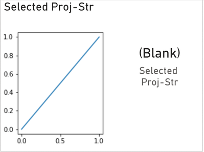
I've made a simple python chart that plots a line from (0,0) to (1,1) not using any actual data from my report. I have thrown a measure in the visual field well since it needs one to plot anything. It's a simple SELECTEDVALUE measure. When I look at the tooltip page itself (as in not via a tooltip from another report page), the python plot works, even though I have no value for the SELECTEDVALUE measure. (Python plot on the left, card visual with the same SELECTEDVALUE measure on the right)
When I look at the tooltip from another report page (using actual tooltip behavior), the plot doesn't draw anything, even though the SELECTEDVALUE measure does have a value.
If it matters, my python code is
import matplotlib.pyplot as plt

# Define the x and y coordinates of the line endpoints
x_values = [0, 1]
y_values = [0, 1]

# Plot the line
plt.plot(x_values, y_values)

# Display the plot
plt.show()
You must be a registered user to add a comment. If you've already registered, sign in. Otherwise, register and sign in.
- rsun_tqb on: Template App "Microsoft 365 Usage Analytics" faili...
- Tortitude on: No able to access Microsoft UI String Search page
-
 mattlee
on:
Input Text Slicer Broken on PBI Services
-
 mattlee
on:
Input Slicer Bug: Cursor jumps to position 0 and v...
-
 mattlee
on:
Input Slicer Causing Browser Tab Freeze in Public ...
- alisonmoraes on: Usuário PPU Sem acesso
-
 mattlee
on:
Small multiples not fitting to scale
- Chandanu14 on: AADSTS50011: Fabric MCP Redirect URI missing from ...
- DanArcher on: Unknown Error on Close & Apply
-
vgeldbr
 on:
Connection Timeout to Azure Analysis Services (AAS...
- New 8,362
- Needs Info 3,502
- Investigating 3,603
- Accepted 2,094
- Declined 38
- Delivered 3,986
-
Reports
10,423 -
Data Modeling
4,220 -
Dashboards
4,176 -
Report Server
2,142 -
Gateways
2,135 -
APIS and Embedding
1,994 -
Custom Visuals
1,823 -
Content Packs
533 -
Mobile
354 -
Need Help
13 -
General Comment
7 -
Show and Tell
3 -
Tips and Tricks
2 -
Power BI Desktop
1

