Get Fabric certified for FREE!
Don't miss your chance to take the Fabric Data Engineer (DP-600) exam for FREE! Find out how by watching the DP-600 session on-demand now through April 28th.
Learn more- Power BI forums
- Get Help with Power BI
- Desktop
- Service
- Report Server
- Power Query
- Mobile Apps
- Developer
- DAX Commands and Tips
- Custom Visuals Development Discussion
- Health and Life Sciences
- Power BI Spanish forums
- Translated Spanish Desktop
- Training and Consulting
- Instructor Led Training
- Dashboard in a Day for Women, by Women
- Galleries
- Data Stories Gallery
- Themes Gallery
- Contests Gallery
- QuickViz Gallery
- Quick Measures Gallery
- Visual Calculations Gallery
- Notebook Gallery
- Translytical Task Flow Gallery
- TMDL Gallery
- R Script Showcase
- Webinars and Video Gallery
- Ideas
- Custom Visuals Ideas (read-only)
- Issues
- Issues
- Events
- Upcoming Events
Join the FabCon + SQLCon recap series. Up next: Power BI, Real-Time Intelligence, IQ and AI, and Data Factory take center stage. All sessions are available on-demand after the live show. Register now
- Power BI forums
- Issues
- Issues
- Problems with streaming data visual tile
- Subscribe to RSS Feed
- Mark as New
- Mark as Read
- Bookmark
- Subscribe
- Printer Friendly Page
- Report Inappropriate Content
Problems with streaming data visual tile
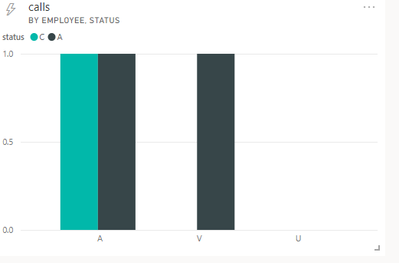
Streaming data is sending such data to PowerBI:
[
{
"status": "C",
"employee": "A",
"calls": 1
},
{
"status": "A",
"employee": "V",
"calls": 1
},
{
"status": "A",
"employee": "U",
"calls": 1
}
]
However, in Visual chart on Tile (axis -> employee, legend -> status), instead of showing one column for each employee, all columns are pushed to the left.
It seems that for each legend field Chart makes columns starting from left to right, and then does the same for next legend field etc.
With larger dataset it looks even uglier:
You must be a registered user to add a comment. If you've already registered, sign in. Otherwise, register and sign in.
- alisonmoraes on: Usuário PPU Sem acesso
-
 mattlee
on:
Small multiples not fitting to scale
- Chandanu14 on: AADSTS50011: Fabric MCP Redirect URI missing from ...
- DanArcher on: Unknown Error on Close & Apply
-
vgeldbr
 on:
Connection Timeout to Azure Analysis Services (AAS...
- zjd4atcdc on: CMD Prompt Popping Up During Changes
-
 mattlee
on:
Problem : Data labels stacked bar chart
-
 mattlee
on:
Previously working Mac calender visual now gives m...
-
 DataZoe
on:
Subject: Regression – Synchronized axis ranges no ...
- chadmkelly on: Power BI Desktop Refresh Issue
- New 8,346
- Needs Info 3,502
- Investigating 3,603
- Accepted 2,094
- Declined 38
- Delivered 3,983
-
Reports
10,411 -
Data Modeling
4,217 -
Dashboards
4,174 -
Report Server
2,139 -
Gateways
2,133 -
APIS and Embedding
1,992 -
Custom Visuals
1,823 -
Content Packs
532 -
Mobile
354 -
Need Help
13 -
General Comment
7 -
Show and Tell
3 -
Tips and Tricks
2 -
Power BI Desktop
1


As far as I know it is not supported to sort data for streaming dataset in Power BI Service, perhaps you need to adjust the order in the json format of the data source manually.
In addition, you can create a new idea here to help us improve Power BI.
It is a place for customers provide feedback about Microsoft Office products . What’s more, if a feedback is high voted there by other customers, it will be promising that Microsoft Product Team will take it into consideration when designing the next version in the future.
Best Regards,
Community Support Team _ Yingjie Li