Fabric Data Days starts November 4th!
Advance your Data & AI career with 50 days of live learning, dataviz contests, hands-on challenges, study groups & certifications and more!
Get registered- Power BI forums
- Get Help with Power BI
- Desktop
- Service
- Report Server
- Power Query
- Mobile Apps
- Developer
- DAX Commands and Tips
- Custom Visuals Development Discussion
- Health and Life Sciences
- Power BI Spanish forums
- Translated Spanish Desktop
- Training and Consulting
- Instructor Led Training
- Dashboard in a Day for Women, by Women
- Galleries
- Data Stories Gallery
- Themes Gallery
- Contests Gallery
- QuickViz Gallery
- Quick Measures Gallery
- Visual Calculations Gallery
- Notebook Gallery
- Translytical Task Flow Gallery
- TMDL Gallery
- R Script Showcase
- Webinars and Video Gallery
- Ideas
- Custom Visuals Ideas (read-only)
- Issues
- Issues
- Events
- Upcoming Events
Get Fabric Certified for FREE during Fabric Data Days. Don't miss your chance! Request now
- Power BI forums
- Issues
- Issues
- **POSSIBLE BUG** Custom button icons are fuzzy...b...
- Subscribe to RSS Feed
- Mark as New
- Mark as Read
- Bookmark
- Subscribe
- Printer Friendly Page
- Report Inappropriate Content
**POSSIBLE BUG** Custom button icons are fuzzy...but only when used as icons
I love that Microsoft has given us the option to use our own icons for buttons in our reports (can't wait to get an icon gallery like with PowerPoint), but I've noticed that icons are fuzzy when they are used in the Icon property but clear as a bell when used as a Fill with the same settings. 😭 Talk about irony.
In the image below, a button with a file as an Icon is on the left and is blurry while another button with the same file as a Fill is on the right and is clear:
The difference is obvious and is incredibly frustrating as it renders the Custom icon feature essentially useless when building client-facing UIs in PBI. Would love to see a fix for this.
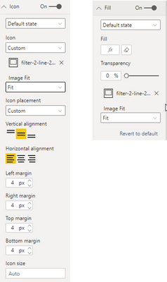
For reference, here are the settings side-by-side:
You must be a registered user to add a comment. If you've already registered, sign in. Otherwise, register and sign in.
-
 parry2k
on:
A Typo about Refence Line in the Format (Korean)
- ricardo_ona on: UDFs annotations Issue with Invoke-ProcessASDataba...
- DeeBaxo on: Export to PowerBI directly from Sharepoint List
-
 mattlee
on:
Automatically expand table columns to fill availab...
- Ghoom on: Azure Maps Controls -> Selection Greyed out
-
awright19
 on:
Open old report, PowerBi hangs
-
 mattlee
on:
Error:Visuals display blank when export report to ...
-
AlenaT
 on:
New Button Slicer: Issue with the Grid type of Arr...
-
 mattlee
on:
List Slicer Button Dimensions Ignored in Service
-
bhalicki
 on:
BUG: report connected to deleted semantic model ca...
- New 8,171
- Needs Info 3,502
- Investigating 3,602
- Accepted 2,090
- Declined 38
- Delivered 3,972
-
Reports
10,310 -
Data Modeling
4,176 -
Dashboards
4,131 -
Gateways
2,126 -
Report Server
2,124 -
APIS and Embedding
1,977 -
Custom Visuals
1,802 -
Content Packs
527 -
Mobile
355 -
Need Help
11 -
General Comment
4 -
Show and Tell
3 -
Tips and Tricks
1 -
Power BI Desktop
1


Hi,
If you have an idea to help to improve the PowerBI, you can go to the Power BI Idea to submit a new idea so that people with the same idea can vote for you. I will also vote for you.
Thank you very much!
Best Regards,
Community Support Team _Robert Qin