Fabric Data Days starts November 4th!
Advance your Data & AI career with 50 days of live learning, dataviz contests, hands-on challenges, study groups & certifications and more!
Get registered- Power BI forums
- Get Help with Power BI
- Desktop
- Service
- Report Server
- Power Query
- Mobile Apps
- Developer
- DAX Commands and Tips
- Custom Visuals Development Discussion
- Health and Life Sciences
- Power BI Spanish forums
- Translated Spanish Desktop
- Training and Consulting
- Instructor Led Training
- Dashboard in a Day for Women, by Women
- Galleries
- Data Stories Gallery
- Themes Gallery
- Contests Gallery
- QuickViz Gallery
- Quick Measures Gallery
- Visual Calculations Gallery
- Notebook Gallery
- Translytical Task Flow Gallery
- TMDL Gallery
- R Script Showcase
- Webinars and Video Gallery
- Ideas
- Custom Visuals Ideas (read-only)
- Issues
- Issues
- Events
- Upcoming Events
Get Fabric Certified for FREE during Fabric Data Days. Don't miss your chance! Request now
- Power BI forums
- Issues
- Issues
- Multi Row Card Display Bug With Time Formats
- Subscribe to RSS Feed
- Mark as New
- Mark as Read
- Bookmark
- Subscribe
- Printer Friendly Page
- Report Inappropriate Content
Multi Row Card Display Bug With Time Formats
Hi,
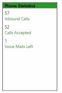
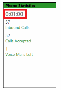
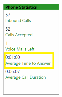
I believe this to be a bug in Power BI. Whenever I use a Multi-Row Card, and display a measure formatted with time (or time in a text format), it messes with the display in the card. Strangely though, when a second Time measure is added, the display seems to return to normal. I am currently using the Desktop version 2.52.4921.682 64-bit (November 2017).
- The top screenshot shows the card with only numeric data labels, no issue there.
- The second screenshot shows those same numbers and a measure formatted to time. For some strange reason, it places the Time data label on the top of the card even though it was placed at the bottom of the Field list, and it's displayed with a larger, bolded format, and without the Category label.
- The third screenshot has everything from the second screenshot, plus a second time measure, and for some reason, when adding the second time measure, it seems to return the display back to normal. If I were to remove the second one, it will revert back to the incorrect display again.


Please let me know if there is anything I can do to fix this behavior, or if it is in fact a bug.
You must be a registered user to add a comment. If you've already registered, sign in. Otherwise, register and sign in.
-
 parry2k
on:
A Typo about Refence Line in the Format (Korean)
- ricardo_ona on: UDFs annotations Issue with Invoke-ProcessASDataba...
- DeeBaxo on: Export to PowerBI directly from Sharepoint List
-
 mattlee
on:
Automatically expand table columns to fill availab...
- Ghoom on: Azure Maps Controls -> Selection Greyed out
-
awright19
 on:
Open old report, PowerBi hangs
-
 mattlee
on:
Error:Visuals display blank when export report to ...
-
AlenaT
 on:
New Button Slicer: Issue with the Grid type of Arr...
-
 mattlee
on:
List Slicer Button Dimensions Ignored in Service
-
bhalicki
 on:
BUG: report connected to deleted semantic model ca...
- New 8,171
- Needs Info 3,502
- Investigating 3,602
- Accepted 2,090
- Declined 38
- Delivered 3,972
-
Reports
10,310 -
Data Modeling
4,176 -
Dashboards
4,131 -
Gateways
2,126 -
Report Server
2,124 -
APIS and Embedding
1,977 -
Custom Visuals
1,802 -
Content Packs
527 -
Mobile
355 -
Need Help
11 -
General Comment
4 -
Show and Tell
3 -
Tips and Tricks
1 -
Power BI Desktop
1