Party with Power BI’s own Guy in a Cube
Power BI is turning 10! Tune in for a special live episode on July 24 with behind-the-scenes stories, product evolution highlights, and a sneak peek at what’s in store for the future.
Save the date- Power BI forums
- Get Help with Power BI
- Desktop
- Service
- Report Server
- Power Query
- Mobile Apps
- Developer
- DAX Commands and Tips
- Custom Visuals Development Discussion
- Health and Life Sciences
- Power BI Spanish forums
- Translated Spanish Desktop
- Training and Consulting
- Instructor Led Training
- Dashboard in a Day for Women, by Women
- Galleries
- Data Stories Gallery
- Themes Gallery
- Contests Gallery
- Quick Measures Gallery
- Notebook Gallery
- Translytical Task Flow Gallery
- TMDL Gallery
- R Script Showcase
- Webinars and Video Gallery
- Ideas
- Custom Visuals Ideas (read-only)
- Issues
- Issues
- Events
- Upcoming Events
Enhance your career with this limited time 50% discount on Fabric and Power BI exams. Ends August 31st. Request your voucher.
- Power BI forums
- Issues
- Issues
- Issue w/ Line and Clustered Column chart axis
- Subscribe to RSS Feed
- Mark as New
- Mark as Read
- Bookmark
- Subscribe
- Printer Friendly Page
- Report Inappropriate Content
Issue w/ Line and Clustered Column chart axis
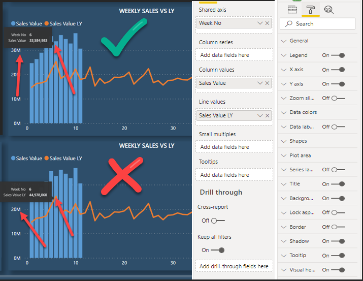
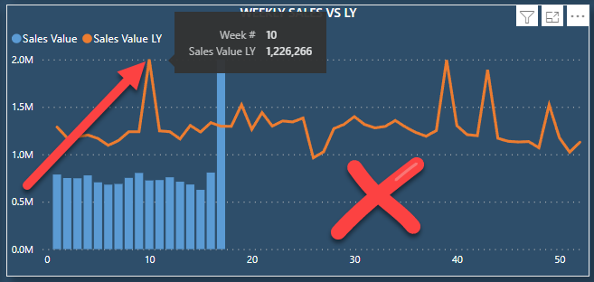
In some data combinations (using slicers) we experience that the line and clustered column chart will display the line chart displaced in reference to the y-axis.
Please see example (same chart, different hover overs – column or line – line fails) (no filters on visual, some filters on page level)
The visualization does not represent the numbers returned by the DAX statement but seems to be displaced or offset.
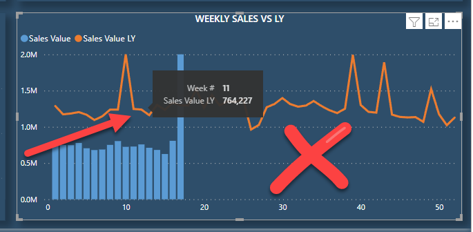
Same chart as above, with different slicer values selected.
DAX and Result can be provided (DAX copied via Perf Analyser)
It’s important to note, that the chart _CAN_ display results correctly, only in certain filtering scenarios the chart is plotting the y-axis line chart offset.
Does anyone have some insights on what could trigger this?
You must be a registered user to add a comment. If you've already registered, sign in. Otherwise, register and sign in.
- stipa on: Error "[403.12–403.30] The name 'Lakehouse.Content...
- MaAl on: "The import PowerPlatform.Dataflows matches no exp...
-
NikNithiy
 on:
URGENT!! Paginated Report not loading on Mozilla F...
- duarte on: Unable to sort months in PowerBI
- zsombor on: Matrix Visual doesn't work with Field Parameters ...
-
 mattlee
on:
“Add Value” in Textbox Not Visible in Dark Theme
- mattin on: Report Server Permissions Jan/May 2025
-
bhalicki
 on:
Bi Crashes on launch with (AS Process PID=XXXXXX H...
- stanteitelbaum on: authenticator wont trigger after purchase of new p...
-
Stinkys
 on:
Fix the Date function in DAX
- New 8,047
- Needs Info 3,502
- Investigating 3,602
- Accepted 2,088
- Declined 38
- Delivered 3,970
-
Reports
10,246 -
Data Modeling
4,135 -
Dashboards
4,116 -
Gateways
2,116 -
Report Server
2,116 -
APIS and Embedding
1,965 -
Custom Visuals
1,790 -
Content Packs
525 -
Mobile
354 -
Need Help
11 -
Show and Tell
3 -
General Comment
2 -
Tips and Tricks
1 -
Power BI Desktop
1


