- Power BI forums
- Updates
- News & Announcements
- Get Help with Power BI
- Desktop
- Service
- Report Server
- Power Query
- Mobile Apps
- Developer
- DAX Commands and Tips
- Custom Visuals Development Discussion
- Health and Life Sciences
- Power BI Spanish forums
- Translated Spanish Desktop
- Power Platform Integration - Better Together!
- Power Platform Integrations (Read-only)
- Power Platform and Dynamics 365 Integrations (Read-only)
- Training and Consulting
- Instructor Led Training
- Dashboard in a Day for Women, by Women
- Galleries
- Community Connections & How-To Videos
- COVID-19 Data Stories Gallery
- Themes Gallery
- Data Stories Gallery
- R Script Showcase
- Webinars and Video Gallery
- Quick Measures Gallery
- 2021 MSBizAppsSummit Gallery
- 2020 MSBizAppsSummit Gallery
- 2019 MSBizAppsSummit Gallery
- Events
- Ideas
- Custom Visuals Ideas
- Issues
- Issues
- Events
- Upcoming Events
- Community Blog
- Power BI Community Blog
- Custom Visuals Community Blog
- Community Support
- Community Accounts & Registration
- Using the Community
- Community Feedback
Earn a 50% discount on the DP-600 certification exam by completing the Fabric 30 Days to Learn It challenge.
- Power BI forums
- Issues
- Issues
- Infographic Chart
- Subscribe to RSS Feed
- Mark as New
- Mark as Read
- Bookmark
- Subscribe
- Printer Friendly Page
- Report Inappropriate Content
Infographic Chart
Hi,
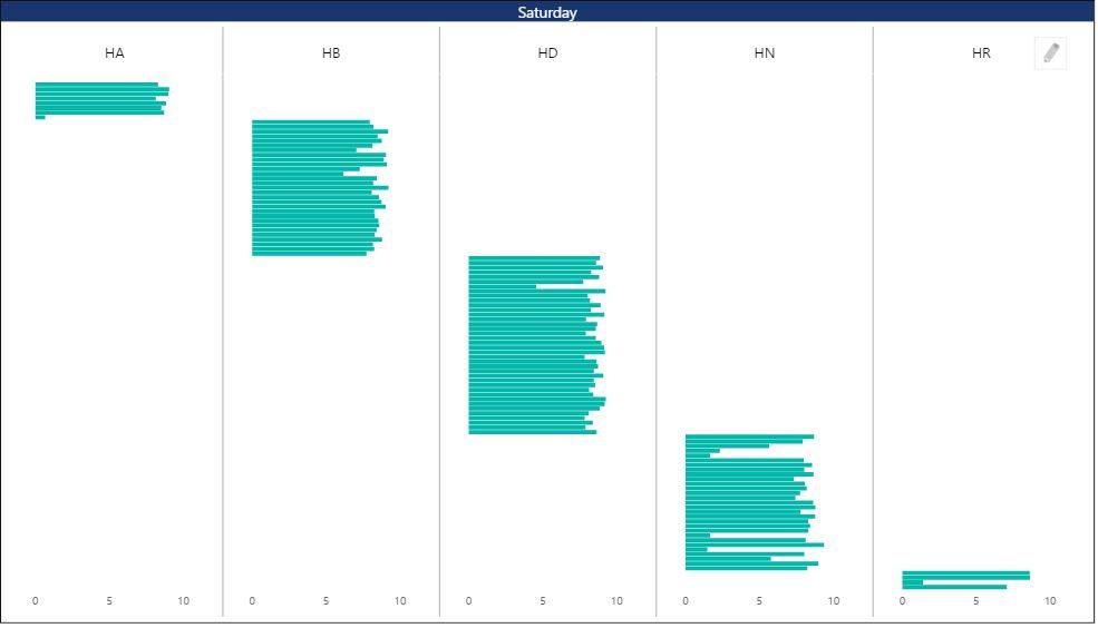
i am trying the new capabilities of the inforphic charts and i assembled into a problem.
My data holds data for many employees that are divided to groups each employee has the hours per day linked to him (1-10)
and each employee is connected to a single group (Y represent the name of the employee).
(there could be different number of group based on the topic- in this case 5 in the topic of Saturday)
the problem is that all the employees are visible in all charts although their value is blank in 4 of them,
if i understand correctly the reason is that the chart looks at all the charts as if they have the same Y axis info.
is there a why to change that that each chart will show only Non blank values? ( each Y will have different names)
Thanks
You must be a registered user to add a comment. If you've already registered, sign in. Otherwise, register and sign in.
-
 v-yetao1-msft
on:
Sort by column glitch / bug
-
 v-xiaoyan-msft
on:
Manage access within the workspace
-
 v-xiaoyan-msft
on:
Missing Page Refresh Option
-
 v-xiaoyan-msft
on:
Send refresh failure notification to Distribution ...
-
 v-xiaoyan-msft
on:
Copilot data access
- okmehere on: [+[LIVESTREAMS]+]* Real Madrid vs Bayern Munich Li...
- sumaya on: ᐉᐉᐉReal Madrid gegen FC Bayern heute live im TV un...
- sumaya on: 🟢✔[STREAMs]**Real Madrid vs Bayern Munich Live Fr...
- sumaya on: ᐉ✔Real Madrid gegen FC Bayern heute live im TV und...
- sumaya on: (ONLINE>) Real gegen Bayern im live tv stream 8 Ma...
- New 8,082
- Needs Info 3,372
- Investigating 3,157
- Accepted 2,035
- Declined 38
- Delivered 3,770
-
Reports
9,714 -
Dashboards
3,999 -
Data Modeling
3,937 -
Gateways
2,081 -
APIS and Embedding
2,040 -
Report Server
2,037 -
Custom Visuals
1,828 -
Content Packs
637 -
Mobile
407 -
Need Help
11 -
Show and Tell
2 -
General Comment
2 -
Tips and Tricks
1 -
Power BI Desktop
1