FabCon is coming to Atlanta
Join us at FabCon Atlanta from March 16 - 20, 2026, for the ultimate Fabric, Power BI, AI and SQL community-led event. Save $200 with code FABCOMM.
Register now!Go To
- Power BI forums
- Get Help with Power BI
- Desktop
- Service
- Report Server
- Power Query
- Mobile Apps
- Developer
- DAX Commands and Tips
- Custom Visuals Development Discussion
- Health and Life Sciences
- Power BI Spanish forums
- Translated Spanish Desktop
- Training and Consulting
- Instructor Led Training
- Dashboard in a Day for Women, by Women
- Galleries
- Data Stories Gallery
- Themes Gallery
- Contests Gallery
- Quick Measures Gallery
- Notebook Gallery
- Translytical Task Flow Gallery
- TMDL Gallery
- R Script Showcase
- Webinars and Video Gallery
- Ideas
- Custom Visuals Ideas (read-only)
- Issues
- Issues
- Events
- Upcoming Events
Turn on suggestions
Auto-suggest helps you quickly narrow down your search results by suggesting possible matches as you type.
Showing results for
Calling all Data Engineers! Fabric Data Engineer (Exam DP-700) live sessions are back! Starting October 16th. Sign up.
- Power BI forums
- Issues
- Issues
- Gantt Chart 2.2.3 visual bug
Idea Options
- Subscribe to RSS Feed
- Mark as New
- Mark as Read
- Bookmark
- Subscribe
- Printer Friendly Page
- Report Inappropriate Content
Gantt Chart 2.2.3 visual bug
Submitted by
Anonymous
on
03-14-2023
03:27 AM
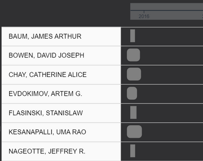
I'm using a Gantt chart to track ownership of assets. All of the below have the same commencement date, and a few months different in end date. As you can see, the start points of the bars are not rendering consistently and some are defaulting to sharp instead of rounded corners. This appears to be a visual bug.
See more ideas labeled with:
Comments
You must be a registered user to add a comment. If you've already registered, sign in. Otherwise, register and sign in.
Latest Comments
- Sofy on: Azure Maps Controls -> Selection Greyed out
- RobSt on: Error:Visuals display blank when export report to ...
-
hb380
 on:
New Button Slicer: Issue with the Grid type of Arr...
-
 mattlee
on:
List Slicer Button Dimensions Ignored in Service
-
bhalicki
 on:
BUG: report connected to deleted semantic model ca...
- Annamarie on: PBI Semantic Model missing
- Ghoom on: Azure map bubble chart is very blurry
-
JoshT
 on:
Deployment pipelines don't support M365 groups
-
 Hongju_Jung
on:
A Typo about Measure tools (Korean)
- jwulffraat on: In the Power BI web version, the left border canno...
Idea Statuses
- New 8,143
- Needs Info 3,502
- Investigating 3,602
- Accepted 2,090
- Declined 38
- Delivered 3,970
-
Reports
10,294 -
Data Modeling
4,168 -
Dashboards
4,129 -
Gateways
2,123 -
Report Server
2,123 -
APIS and Embedding
1,975 -
Custom Visuals
1,799 -
Content Packs
527 -
Mobile
355 -
Need Help
11 -
Show and Tell
3 -
General Comment
3 -
Tips and Tricks
1 -
Power BI Desktop
1
