FabCon is coming to Atlanta
Join us at FabCon Atlanta from March 16 - 20, 2026, for the ultimate Fabric, Power BI, AI and SQL community-led event. Save $200 with code FABCOMM.
Register now!- Power BI forums
- Get Help with Power BI
- Desktop
- Service
- Report Server
- Power Query
- Mobile Apps
- Developer
- DAX Commands and Tips
- Custom Visuals Development Discussion
- Health and Life Sciences
- Power BI Spanish forums
- Translated Spanish Desktop
- Training and Consulting
- Instructor Led Training
- Dashboard in a Day for Women, by Women
- Galleries
- Data Stories Gallery
- Themes Gallery
- Contests Gallery
- QuickViz Gallery
- Quick Measures Gallery
- Visual Calculations Gallery
- Notebook Gallery
- Translytical Task Flow Gallery
- TMDL Gallery
- R Script Showcase
- Webinars and Video Gallery
- Ideas
- Custom Visuals Ideas (read-only)
- Issues
- Issues
- Events
- Upcoming Events
Vote for your favorite vizzies from the Power BI Dataviz World Championship submissions. Vote now!
- Power BI forums
- Issues
- Issues
- Forecasting Visuals
- Subscribe to RSS Feed
- Mark as New
- Mark as Read
- Bookmark
- Subscribe
- Printer Friendly Page
- Report Inappropriate Content
Forecasting Visuals
I have a data that shows business over 4 or 5 years. We are awarded the contract in year 0. We calculate the spread of the amount over the duration of the contracted project.
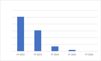
While using Excel, I can use charts which portray the data as column chart separated by space and driven by the column and no other data.
In PowerBI, I have to use clustered or stacked columns. In clustered columns, all the columns are attached to each other and concentrated in the middle. Is there any way that I can spread those out over the window, without using any non numerical distinguishers? In short I would want the data to look as the image attached.
You must be a registered user to add a comment. If you've already registered, sign in. Otherwise, register and sign in.
- nikita9158 on: Text Input Slicer is not reset by bookmarks in Pow...
-
josephws
 on:
Azure maps not displaying mapped data points in pu...
-
 Hans-Georg_Puls
on:
Desktop Application Bug?? - PBI desktop applicatio...
-
 mattlee
on:
Combo chart secondary Y-axis renders incorrectly i...
- zllll on: [problem] New Text Slicer in Power BI service is n...
-
 mattlee
on:
Combo chart - custom data label for line chart not...
- kevinlewis56 on: Request for PL-300 Exam Voucher Extension Due to H...
-
 Hongju_Jung
on:
Translation Issue in the Korean Version
- Nameless_LW on: Unable to find latest powerbi gateway STANDARD MOD...
- djordje369 on: Installing an update from template app fails
- New 8,279
- Needs Info 3,502
- Investigating 3,603
- Accepted 2,092
- Declined 38
- Delivered 3,975
-
Reports
10,377 -
Data Modeling
4,204 -
Dashboards
4,151 -
Report Server
2,137 -
Gateways
2,130 -
APIS and Embedding
1,983 -
Custom Visuals
1,810 -
Content Packs
528 -
Mobile
354 -
Need Help
12 -
General Comment
7 -
Show and Tell
3 -
Tips and Tricks
2 -
Power BI Desktop
1

Hi @desmon316,
You mean you want something like the following picture but Clustered column or Stacked column chart couldn’t fulfill? As you can see, the following char is created with Clustered column chart which is similar to the screenshot from you.
If I misunderstand your needs, please feel free to let me know. Thanks in advance!
Best Regards,
Community Support Team _ Caiyun