FabCon is coming to Atlanta
Join us at FabCon Atlanta from March 16 - 20, 2026, for the ultimate Fabric, Power BI, AI and SQL community-led event. Save $200 with code FABCOMM.
Register now!- Power BI forums
- Get Help with Power BI
- Desktop
- Service
- Report Server
- Power Query
- Mobile Apps
- Developer
- DAX Commands and Tips
- Custom Visuals Development Discussion
- Health and Life Sciences
- Power BI Spanish forums
- Translated Spanish Desktop
- Training and Consulting
- Instructor Led Training
- Dashboard in a Day for Women, by Women
- Galleries
- Data Stories Gallery
- Themes Gallery
- Contests Gallery
- QuickViz Gallery
- Quick Measures Gallery
- Visual Calculations Gallery
- Notebook Gallery
- Translytical Task Flow Gallery
- TMDL Gallery
- R Script Showcase
- Webinars and Video Gallery
- Ideas
- Custom Visuals Ideas (read-only)
- Issues
- Issues
- Events
- Upcoming Events
The Power BI Data Visualization World Championships is back! Get ahead of the game and start preparing now! Learn more
- Power BI forums
- Issues
- Issues
- Display issues with multirow card with text values...
- Subscribe to RSS Feed
- Mark as New
- Mark as Read
- Bookmark
- Subscribe
- Printer Friendly Page
- Report Inappropriate Content
Display issues with multirow card with text values (category missing, incorrect order of fields)
I was trying to use the multi-row card to display several measures in my dashboard and it came to a point where I have to use it as a makeshift label. To my surprise, the multi-row card doesn't play nice with text values in measures.
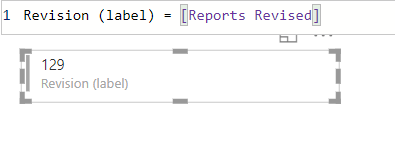
This is the measure that I am trying to display in the multi-row card. Notice how the category label ("Revision (label)" seemingly disappear.
The [Reports Revised] measure is just a simple COUNTROWS measure, with a whole number format value. The category label displays properly in this case.
I then swapped it with a number-to-text converted [Error Rate] measure to test if it's working fine (I can use percentages just fine, but please note that I have to combine both measures in a format similar to the first screenshot). This time, the category label does not display properly.
Below is the multicard with several measures displayed. The first measure displayed is the text-value [Revision (label)] measure, the other is a number-value [Reports Reviewed] measure. Due note that in the Fields pane of the visual, the first item there is the [Reports Reviewed] measure and the [Revision (label)] is the last, but the [Revision (label)] measure shows up as the very first measure in the visual.
This behavior is very unusual and I would think that the visual should treat the values of whatever fields are fed into it uniformly, and that it should show them in the order that they were plugged into the visual.
You must be a registered user to add a comment. If you've already registered, sign in. Otherwise, register and sign in.
-
 Hongju_Jung
on:
A Typo about Visual Gridline in the View menu (Kor...
- jake18 on: Fix High Vulnerabilities found in On-Prem Data Gat...
- BI_Tiffin on: Power BI Azure Map - Connecticut Geocoding Ambigui...
-
acig
 on:
Issue with new card visual - reference labels spac...
- catsamson on: Issues with new card visual displaying an URL imag...
- Shackleton on: Image in New Card Visual (incorrect size)
- Dilshanik on: Issue with new card visual after publishing to PBI...
- tejaswi_464 on: DataFormat.Error: There were more columns in the r...
-
Ian_Stuart_Rupe
 on:
Issue with Card Visual Layout After November Power...
- Murzao on: Bug Report: Unable to send dataflow refresh failur...
- New 8,230
- Needs Info 3,502
- Investigating 3,602
- Accepted 2,089
- Declined 38
- Delivered 3,976
-
Reports
10,345 -
Data Modeling
4,189 -
Dashboards
4,146 -
Gateways
2,128 -
Report Server
2,128 -
APIS and Embedding
1,980 -
Custom Visuals
1,807 -
Content Packs
528 -
Mobile
355 -
Need Help
12 -
General Comment
7 -
Show and Tell
3 -
Tips and Tricks
2 -
Power BI Desktop
1


