Fabric Data Days starts November 4th!
Advance your Data & AI career with 50 days of live learning, dataviz contests, hands-on challenges, study groups & certifications and more!
Get registered- Power BI forums
- Get Help with Power BI
- Desktop
- Service
- Report Server
- Power Query
- Mobile Apps
- Developer
- DAX Commands and Tips
- Custom Visuals Development Discussion
- Health and Life Sciences
- Power BI Spanish forums
- Translated Spanish Desktop
- Training and Consulting
- Instructor Led Training
- Dashboard in a Day for Women, by Women
- Galleries
- Data Stories Gallery
- Themes Gallery
- Contests Gallery
- QuickViz Gallery
- Quick Measures Gallery
- Visual Calculations Gallery
- Notebook Gallery
- Translytical Task Flow Gallery
- TMDL Gallery
- R Script Showcase
- Webinars and Video Gallery
- Ideas
- Custom Visuals Ideas (read-only)
- Issues
- Issues
- Events
- Upcoming Events
Get Fabric Certified for FREE during Fabric Data Days. Don't miss your chance! Request now
- Power BI forums
- Issues
- Issues
- Data Colors in Service Change from One Day to the ...
- Subscribe to RSS Feed
- Mark as New
- Mark as Read
- Bookmark
- Subscribe
- Printer Friendly Page
- Report Inappropriate Content
Data Colors in Service Change from One Day to the Next
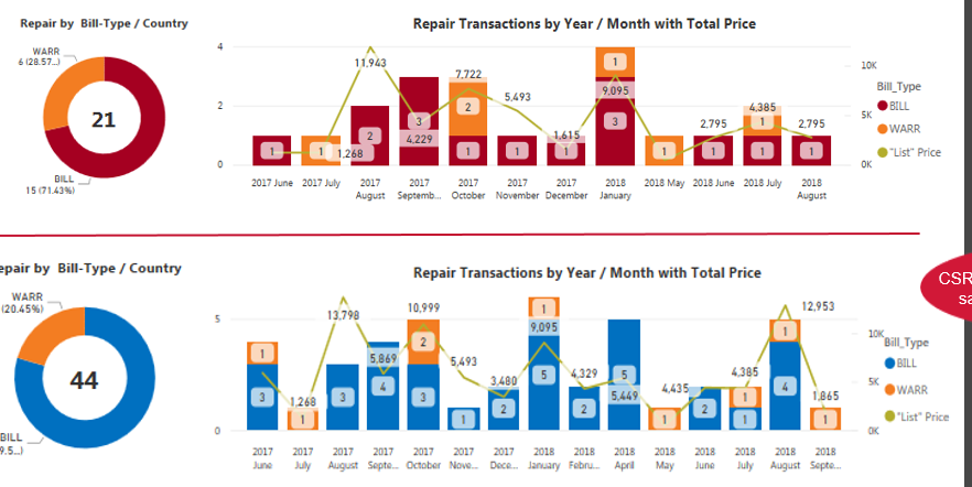
We have a report that is used by hundreds of users in presenting data to customers, and we're finding that the data colors in the same exact visual with the same exact legend headings changes from one day to the next when the report is accessed on the service. Note the item BILL is a different color yesterday, vs. today's output. Obviously, we'd like the colors to remain consistent for customer presentation as well as user understanding from day to day. Both images below are from the service.
You must be a registered user to add a comment. If you've already registered, sign in. Otherwise, register and sign in.
- tejaswi_464 on: DataFormat.Error: There were more columns in the r...
-
 DataZoe
on:
Issue with Card Visual Layout After November Power...
- Murzao on: Bug Report: Unable to send dataflow refresh failur...
- mb123_ on: Bug in sorting - Gantt 3.4.2.0 from Microsoft
-
DNMAF
 on:
Adding a measure or column as a tooltip to an Azur...
- Kevin_Wells81 on: Measure creation in Power BI Desktop is extremely ...
-
 parry2k
on:
A Typo about Refence Line in the Format (Korean)
- ricardo_ona on: UDFs annotations Issue with Invoke-ProcessASDataba...
- DeeBaxo on: Export to PowerBI directly from Sharepoint List
-
 mattlee
on:
Automatically expand table columns to fill availab...
- New 8,197
- Needs Info 3,502
- Investigating 3,603
- Accepted 2,088
- Declined 38
- Delivered 3,974
-
Reports
10,325 -
Data Modeling
4,183 -
Dashboards
4,137 -
Gateways
2,127 -
Report Server
2,125 -
APIS and Embedding
1,978 -
Custom Visuals
1,805 -
Content Packs
527 -
Mobile
355 -
Need Help
11 -
General Comment
4 -
Show and Tell
3 -
Tips and Tricks
1 -
Power BI Desktop
1
