Join the #PBI10 DataViz contest
Power BI is turning 10, and we’re marking the occasion with a special community challenge. Use your creativity to tell a story, uncover trends, or highlight something unexpected.
Get started- Power BI forums
- Get Help with Power BI
- Desktop
- Service
- Report Server
- Power Query
- Mobile Apps
- Developer
- DAX Commands and Tips
- Custom Visuals Development Discussion
- Health and Life Sciences
- Power BI Spanish forums
- Translated Spanish Desktop
- Training and Consulting
- Instructor Led Training
- Dashboard in a Day for Women, by Women
- Galleries
- Webinars and Video Gallery
- Data Stories Gallery
- Themes Gallery
- Contests Gallery
- Quick Measures Gallery
- Notebook Gallery
- Translytical Task Flow Gallery
- R Script Showcase
- Ideas
- Custom Visuals Ideas (read-only)
- Issues
- Issues
- Events
- Upcoming Events
Join us for an expert-led overview of the tools and concepts you'll need to become a Certified Power BI Data Analyst and pass exam PL-300. Register now.
- Power BI forums
- Issues
- Issues
- Conditional formatting for Data label colors at li...
- Subscribe to RSS Feed
- Mark as New
- Mark as Read
- Bookmark
- Subscribe
- Printer Friendly Page
- Report Inappropriate Content
Conditional formatting for Data label colors at line level
When using conditional formatting for data labels, as introduced in July 2021, the overall number is used for the calculation, instead of the line number average.
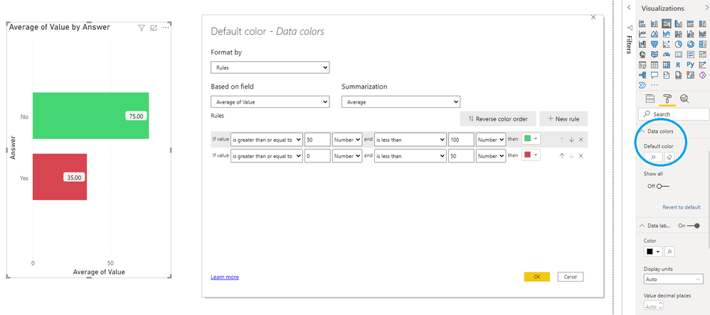
Using "data colors > default color > fx" gives the expected behavior. Bars with an average value above 50 are green, others red:
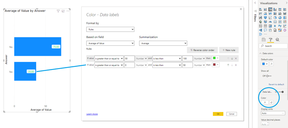
However, when choosing "data labels > color > fx", the same setup results in all data labels shown in a green font:
Expected behavior is that a bar with an average value below 50 shows a data label with a red font color.
Thus, using the context specific calculated value for that line/bar.
You must be a registered user to add a comment. If you've already registered, sign in. Otherwise, register and sign in.
-
 mattlee
on:
“Add Value” in Textbox Not Visible in Dark Theme
- mattin on: Report Server Permissions Jan/May 2025
-
bhalicki
 on:
Bi Crashes on launch with (AS Process PID=XXXXXX H...
- stanteitelbaum on: authenticator wont trigger after purchase of new p...
-
Stinkys
 on:
Fix the Date function in DAX
-
Stinkys
 on:
Cannot login to community site
-
reubwork
 on:
May 25 update for Snowflake Connector v2 has broke...
-
dmkblesser
 on:
Unable to open existing PBIP files
- DamoUK on: Gateway issues
- davidebacci on: Total Labels not following dynamic formatting rule...
- New 8,014
- Needs Info 3,502
- Investigating 3,602
- Accepted 2,088
- Declined 38
- Delivered 3,970
-
Reports
10,225 -
Data Modeling
4,129 -
Dashboards
4,111 -
Report Server
2,114 -
Gateways
2,112 -
APIS and Embedding
1,963 -
Custom Visuals
1,786 -
Content Packs
523 -
Mobile
354 -
Need Help
11 -
Show and Tell
3 -
General Comment
2 -
Tips and Tricks
1 -
Power BI Desktop
1

