FabCon is coming to Atlanta
Join us at FabCon Atlanta from March 16 - 20, 2026, for the ultimate Fabric, Power BI, AI and SQL community-led event. Save $200 with code FABCOMM.
Register now!- Power BI forums
- Get Help with Power BI
- Desktop
- Service
- Report Server
- Power Query
- Mobile Apps
- Developer
- DAX Commands and Tips
- Custom Visuals Development Discussion
- Health and Life Sciences
- Power BI Spanish forums
- Translated Spanish Desktop
- Training and Consulting
- Instructor Led Training
- Dashboard in a Day for Women, by Women
- Galleries
- Data Stories Gallery
- Themes Gallery
- Contests Gallery
- QuickViz Gallery
- Quick Measures Gallery
- Visual Calculations Gallery
- Notebook Gallery
- Translytical Task Flow Gallery
- TMDL Gallery
- R Script Showcase
- Webinars and Video Gallery
- Ideas
- Custom Visuals Ideas (read-only)
- Issues
- Issues
- Events
- Upcoming Events
The Power BI Data Visualization World Championships is back! Get ahead of the game and start preparing now! Learn more
- Power BI forums
- Issues
- Issues
- Conditional formatting data labels not working cor...
- Subscribe to RSS Feed
- Mark as New
- Mark as Read
- Bookmark
- Subscribe
- Printer Friendly Page
- Report Inappropriate Content
Conditional formatting data labels not working correctly in clustered column chart
Hello All,
As suggested by @amitchandak im reporting this as an issue.
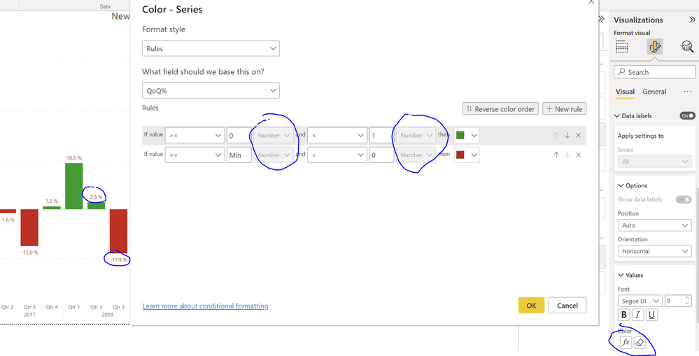
Im trying to format data labels that are already in %, to color negative numbers red and positive green.
The selection of number and percentage is blocked, number is grayed out.
I tried the solution below but does not work, it displays all numbers as red.
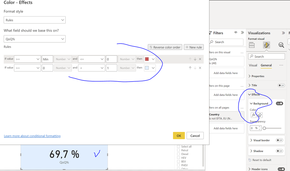
I tried to do the same creating a card visual and trying exactly the same parameters that i used for the data labels (but in effect - background) works perfectly.
I would appreciate if someone could help me with this issue.
Thanks in advance
I use Power Bi Desktop June 2022 version
You must be a registered user to add a comment. If you've already registered, sign in. Otherwise, register and sign in.
- YacAaz on: Combo chart - custom data label for line chart not...
- kevinlewis56 on: Request for PL-300 Exam Voucher Extension Due to H...
-
 Hongju_Jung
on:
Translation Issue in the Korean Version
- Nameless_LW on: Unable to find latest powerbi gateway STANDARD MOD...
- djordje369 on: Installing an update from template app fails
-
 Hongju_Jung
on:
A Typo about Visual Gridline in the View menu (Kor...
- jake18 on: Fix High Vulnerabilities found in On-Prem Data Gat...
- BI_Tiffin on: Power BI Azure Map - Connecticut Geocoding Ambigui...
-
acig
 on:
Issue with new card visual - reference labels spac...
- catsamson on: Issues with new card visual displaying an URL imag...
- New 8,247
- Needs Info 3,502
- Investigating 3,602
- Accepted 2,089
- Declined 38
- Delivered 3,975
-
Reports
10,356 -
Data Modeling
4,192 -
Dashboards
4,147 -
Report Server
2,132 -
Gateways
2,130 -
APIS and Embedding
1,981 -
Custom Visuals
1,808 -
Content Packs
528 -
Mobile
354 -
Need Help
12 -
General Comment
7 -
Show and Tell
3 -
Tips and Tricks
2 -
Power BI Desktop
1


Update:
The fix for this feature will be released in the second week of August as expected, so stay tuned.
Best Regards,
Community Support Team _ Yingjie Li