Huge last-minute discounts for FabCon Vienna from September 15-18, 2025
Supplies are limited. Contact info@espc.tech right away to save your spot before the conference sells out.
Get your discount- Power BI forums
- Get Help with Power BI
- Desktop
- Service
- Report Server
- Power Query
- Mobile Apps
- Developer
- DAX Commands and Tips
- Custom Visuals Development Discussion
- Health and Life Sciences
- Power BI Spanish forums
- Translated Spanish Desktop
- Training and Consulting
- Instructor Led Training
- Dashboard in a Day for Women, by Women
- Galleries
- Data Stories Gallery
- Themes Gallery
- Contests Gallery
- Quick Measures Gallery
- Notebook Gallery
- Translytical Task Flow Gallery
- TMDL Gallery
- R Script Showcase
- Webinars and Video Gallery
- Ideas
- Custom Visuals Ideas (read-only)
- Issues
- Issues
- Events
- Upcoming Events
Score big with last-minute savings on the final tickets to FabCon Vienna. Secure your discount
- Power BI forums
- Issues
- Issues
- Clustered Column Chart - Column Width
- Subscribe to RSS Feed
- Mark as New
- Mark as Read
- Bookmark
- Subscribe
- Printer Friendly Page
- Report Inappropriate Content
Clustered Column Chart - Column Width
Hi,
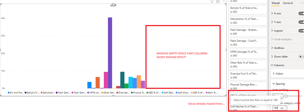
There is an issue with the clustered column chart where if you have a lot of data categories per cluster the columns become far too narrow to be easy to interpret, especially with cross highlighting applied to the columns.
Is it possible to have the minimum category width settings limit lifted from the current of 180px? I will attach a screenshot showing that the one option available is already maxed and yet there is a huge amount of "whitespace" that just can't be utilised with the current config.
When you have a large number of clusters with only a few data points per cluster (2-3 for example) then the minimum category width can definitely help to make columns a better size visually, but there is no way to make charts with only 1 - 2 clusters but many data points per cluster better visually as generally speaking they are over the "minimum category width" already.
Ideally the max value of "minimum category width" should be at least as high as the width of the visual itself. Currently seems to auto scale to only 1/3 of the width of the visual.
I have googled around extensively about this and have seen many other users encountering issues with the same thing and no solutions.
Any changes to resolve this would be greatly appreciated.
You must be a registered user to add a comment. If you've already registered, sign in. Otherwise, register and sign in.
- DataMindedLLC on: 'Refresh Preview' gone from Home Menu Bar in Aug 2...
- Sree9100822653 on: undefinedHow to send daily RLS-based Power BI repo...
- annelebel on: August 2025 Update Changed DirectQuery so each tab...
- manu_panizi on: Direct Query Mode Missing
- Jstukenborg on: Data on Power BI desktop is not refreshing
- noahfox on: Fabric 'Deploy Stage Content' API fails when user ...
- erpfau on: Fields Parameter w. hierarchies: provide option to...
- Rabea_Damlakhy on: Critical Bug: Deleting a Visual Group on One Page ...
- discolisa on: Remove / Copy Visual issue - July 2025 Desktop Iss...
- stipa on: Error "[403.12–403.30] The name 'Lakehouse.Content...
- New 8,095
- Needs Info 3,502
- Investigating 3,602
- Accepted 2,088
- Declined 38
- Delivered 3,970
-
Reports
10,267 -
Data Modeling
4,154 -
Dashboards
4,121 -
Report Server
2,119 -
Gateways
2,118 -
APIS and Embedding
1,971 -
Custom Visuals
1,793 -
Content Packs
526 -
Mobile
354 -
Need Help
11 -
Show and Tell
3 -
General Comment
2 -
Tips and Tricks
1 -
Power BI Desktop
1
