Join us at FabCon Vienna from September 15-18, 2025
The ultimate Fabric, Power BI, SQL, and AI community-led learning event. Save €200 with code FABCOMM.
Get registered- Power BI forums
- Get Help with Power BI
- Desktop
- Service
- Report Server
- Power Query
- Mobile Apps
- Developer
- DAX Commands and Tips
- Custom Visuals Development Discussion
- Health and Life Sciences
- Power BI Spanish forums
- Translated Spanish Desktop
- Training and Consulting
- Instructor Led Training
- Dashboard in a Day for Women, by Women
- Galleries
- Data Stories Gallery
- Themes Gallery
- Contests Gallery
- Quick Measures Gallery
- Notebook Gallery
- Translytical Task Flow Gallery
- TMDL Gallery
- R Script Showcase
- Webinars and Video Gallery
- Ideas
- Custom Visuals Ideas (read-only)
- Issues
- Issues
- Events
- Upcoming Events
Enhance your career with this limited time 50% discount on Fabric and Power BI exams. Ends August 31st. Request your voucher.
- Power BI forums
- Issues
- Issues
- BUG: Shape Map - Legend not working
- Subscribe to RSS Feed
- Mark as New
- Mark as Read
- Bookmark
- Subscribe
- Printer Friendly Page
- Report Inappropriate Content
BUG: Shape Map - Legend not working
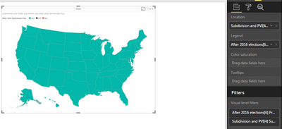
Hi - I'm having problems using shape map. When I use the legend field, the entire map shows as the first value.
For example, using the US election data table from this page https://en.wikipedia.org/wiki/United_States_elections,_2016
All the states are coloured in the first colour (DEM), although that is clearly not correct.
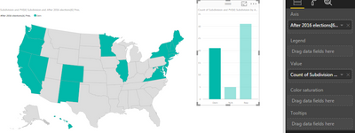
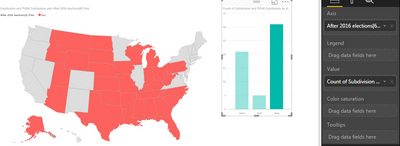
However, if I add a column chart based on the same data and use that to cross-filter, this filters the states correctly:
This shows that the map is working, and the data is linking correctly to the map keys. It's just when there is no filter, the whole map is coloured to the first option.
I'm on the latest download.
You must be a registered user to add a comment. If you've already registered, sign in. Otherwise, register and sign in.
- Sree9100822653 on: undefinedHow to send daily RLS-based Power BI repo...
- annelebel on: August 2025 Update Changed DirectQuery so each tab...
- katokeis on: Direct Query Mode Missing
- Jstukenborg on: Data on Power BI desktop is not refreshing
- noahfox on: Fabric 'Deploy Stage Content' API fails when user ...
- erpfau on: Fields Parameter w. hierarchies: provide option to...
- Rabea_Damlakhy on: Critical Bug: Deleting a Visual Group on One Page ...
- discolisa on: Remove / Copy Visual issue - July 2025 Desktop Iss...
- stipa on: Error "[403.12–403.30] The name 'Lakehouse.Content...
-
klinejordan
 on:
URL is not filtering on field parameter
- New 8,086
- Needs Info 3,502
- Investigating 3,602
- Accepted 2,088
- Declined 38
- Delivered 3,970
-
Reports
10,262 -
Data Modeling
4,150 -
Dashboards
4,120 -
Report Server
2,119 -
Gateways
2,118 -
APIS and Embedding
1,970 -
Custom Visuals
1,793 -
Content Packs
525 -
Mobile
354 -
Need Help
11 -
Show and Tell
3 -
General Comment
2 -
Tips and Tricks
1 -
Power BI Desktop
1


