Join us at FabCon Vienna from September 15-18, 2025
The ultimate Fabric, Power BI, SQL, and AI community-led learning event. Save €200 with code FABCOMM.
Get registered- Power BI forums
- Get Help with Power BI
- Desktop
- Service
- Report Server
- Power Query
- Mobile Apps
- Developer
- DAX Commands and Tips
- Custom Visuals Development Discussion
- Health and Life Sciences
- Power BI Spanish forums
- Translated Spanish Desktop
- Training and Consulting
- Instructor Led Training
- Dashboard in a Day for Women, by Women
- Galleries
- Data Stories Gallery
- Themes Gallery
- Contests Gallery
- Quick Measures Gallery
- Notebook Gallery
- Translytical Task Flow Gallery
- TMDL Gallery
- R Script Showcase
- Webinars and Video Gallery
- Ideas
- Custom Visuals Ideas (read-only)
- Issues
- Issues
- Events
- Upcoming Events
Enhance your career with this limited time 50% discount on Fabric and Power BI exams. Ends August 31st. Request your voucher.
- Power BI forums
- Issues
- Issues
- ArcGIS for Power BI - Join Layer field - Custom po...
- Subscribe to RSS Feed
- Mark as New
- Mark as Read
- Bookmark
- Subscribe
- Printer Friendly Page
- Report Inappropriate Content
ArcGIS for Power BI - Join Layer field - Custom polygon parcel
Hi,
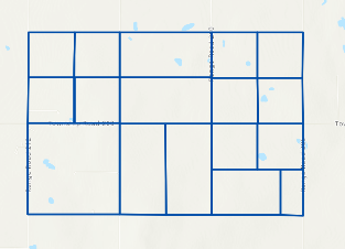
I have a map from ArcGIS with custom parcels layer (see picture below).

In the visualizations menu of the ArcGIS map, I didn't use any location field. I used the "join layer" field to match my data to ArcGIS. And this works perfectly, I can select areas in the map and it will filter all visuals in my dashboard.
In my next step, I would like to have colors for each areas depending in a status column in my data.
My idea was to add this status column in the "color" field, but nothing happens...
Any suggestion to get these fields colored?
Thanking you in advance.
You must be a registered user to add a comment. If you've already registered, sign in. Otherwise, register and sign in.
- Jstukenborg on: Data on Power BI desktop is not refreshing
- levkro1234 on: Fields Parameter w. hierarchies: provide option to...
-
allyklee
 on:
Critical Bug: Deleting a Visual Group on One Page ...
-
allyklee
 on:
Remove / Copy Visual issue - July 2025 Desktop Iss...
- stipa on: Error "[403.12–403.30] The name 'Lakehouse.Content...
-
klinejordan
 on:
URL is not filtering on field parameter
- MaAl on: "The import PowerPlatform.Dataflows matches no exp...
-
NikNithiy
 on:
URGENT!! Paginated Report not loading on Mozilla F...
- duarte on: Unable to sort months in PowerBI
- levkro1234 on: Matrix Visual doesn't work with Field Parameters ...
- New 8,064
- Needs Info 3,502
- Investigating 3,602
- Accepted 2,088
- Declined 38
- Delivered 3,970
-
Reports
10,256 -
Data Modeling
4,139 -
Dashboards
4,116 -
Report Server
2,117 -
Gateways
2,116 -
APIS and Embedding
1,968 -
Custom Visuals
1,792 -
Content Packs
525 -
Mobile
354 -
Need Help
11 -
Show and Tell
3 -
General Comment
2 -
Tips and Tricks
1 -
Power BI Desktop
1