- Power BI forums
- Updates
- News & Announcements
- Get Help with Power BI
- Desktop
- Service
- Report Server
- Power Query
- Mobile Apps
- Developer
- DAX Commands and Tips
- Custom Visuals Development Discussion
- Health and Life Sciences
- Power BI Spanish forums
- Translated Spanish Desktop
- Power Platform Integration - Better Together!
- Power Platform Integrations (Read-only)
- Power Platform and Dynamics 365 Integrations (Read-only)
- Training and Consulting
- Instructor Led Training
- Dashboard in a Day for Women, by Women
- Galleries
- Community Connections & How-To Videos
- COVID-19 Data Stories Gallery
- Themes Gallery
- Data Stories Gallery
- R Script Showcase
- Webinars and Video Gallery
- Quick Measures Gallery
- 2021 MSBizAppsSummit Gallery
- 2020 MSBizAppsSummit Gallery
- 2019 MSBizAppsSummit Gallery
- Events
- Ideas
- Custom Visuals Ideas
- Issues
- Issues
- Events
- Upcoming Events
- Community Blog
- Power BI Community Blog
- Custom Visuals Community Blog
- Community Support
- Community Accounts & Registration
- Using the Community
- Community Feedback
Register now to learn Fabric in free live sessions led by the best Microsoft experts. From Apr 16 to May 9, in English and Spanish.
- Power BI forums
- Issues
- Issues
- ArcGIS for Power BI - Join Layer field - Custom po...
- Subscribe to RSS Feed
- Mark as New
- Mark as Read
- Bookmark
- Subscribe
- Printer Friendly Page
- Report Inappropriate Content
ArcGIS for Power BI - Join Layer field - Custom polygon parcel
Hi,
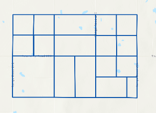
I have a map from ArcGIS with custom parcels layer (see picture below).

In the visualizations menu of the ArcGIS map, I didn't use any location field. I used the "join layer" field to match my data to ArcGIS. And this works perfectly, I can select areas in the map and it will filter all visuals in my dashboard.
In my next step, I would like to have colors for each areas depending in a status column in my data.
My idea was to add this status column in the "color" field, but nothing happens...
Any suggestion to get these fields colored?
Thanking you in advance.
You must be a registered user to add a comment. If you've already registered, sign in. Otherwise, register and sign in.
- Hari on: Admin Monitoring Workspace - Dataset has removed f...
-
 v-xiaoyan-msft
on:
Report jumps between two profile logins.
- mgast on: Conditional formatting from PowerBI Desktop is not...
- iannedrs on: Error: There is an error in XML document (1, 1).
-
 v-xiaoyan-msft
on:
Cannot share PowerBi reorts and dashboards to my o...
-
rayishome
 on:
Get External Data: Power BI semantic models throws...
-
 v-yetao1-msft
on:
Power BI Desktop April 2024 : Sort by issue. False...
-
rdnguyen
 on:
Power BI Service - NetworkConnectionIssue when sav...
-
 v-yetao1-msft
on:
Power BI semantic model account sign in for every ...
-
 Idrissshatila
on:
Timeline slicer is showing 30 & 31 March under 30 ...
- New 7,841
- Needs Info 3,356
- Investigating 3,127
- Accepted 2,036
- Declined 38
- Delivered 3,743
-
Reports
9,662 -
Dashboards
3,899 -
Data Modeling
3,853 -
Gateways
2,040 -
Report Server
2,001 -
APIS and Embedding
1,882 -
Custom Visuals
1,670 -
Content Packs
502 -
Mobile
347 -
Need Help
11 -
Show and Tell
2 -
General Comment
2 -
Tips and Tricks
1 -
Power BI Desktop
1
Hi @Nass ,
Based on my research, there is no such a functionaly to allow us to select custom colors depending in a status column.
If you would like to suggest feature improvements, you may vote the idea and comment here to improve this feature. It is a place for customers provide feedback about Microsoft Office products . What’s more, if a feedback is high voted there by other customers, it will be promising that Microsoft Product Team will take it into consideration when designing the next version in the future.
Best Regards,
Community Support Team _ Caitlyn