- Power BI forums
- Updates
- News & Announcements
- Get Help with Power BI
- Desktop
- Service
- Report Server
- Power Query
- Mobile Apps
- Developer
- DAX Commands and Tips
- Custom Visuals Development Discussion
- Health and Life Sciences
- Power BI Spanish forums
- Translated Spanish Desktop
- Power Platform Integration - Better Together!
- Power Platform Integrations (Read-only)
- Power Platform and Dynamics 365 Integrations (Read-only)
- Training and Consulting
- Instructor Led Training
- Dashboard in a Day for Women, by Women
- Galleries
- Community Connections & How-To Videos
- COVID-19 Data Stories Gallery
- Themes Gallery
- Data Stories Gallery
- R Script Showcase
- Webinars and Video Gallery
- Quick Measures Gallery
- 2021 MSBizAppsSummit Gallery
- 2020 MSBizAppsSummit Gallery
- 2019 MSBizAppsSummit Gallery
- Events
- Ideas
- Custom Visuals Ideas
- Issues
- Issues
- Events
- Upcoming Events
- Community Blog
- Power BI Community Blog
- Custom Visuals Community Blog
- Community Support
- Community Accounts & Registration
- Using the Community
- Community Feedback
Register now to learn Fabric in free live sessions led by the best Microsoft experts. From Apr 16 to May 9, in English and Spanish.
- Power BI forums
- Issues
- Issues
- line and clustered column chart - line to short
- Subscribe to RSS Feed
- Mark as New
- Mark as Read
- Bookmark
- Subscribe
- Printer Friendly Page
- Report Inappropriate Content
line and clustered column chart - line to short
Hi, I have the following issue: my columns show the actual values, the line should show the goal. The goal is a measure, the value is fix depending on the filter set (Filter =1 ==> Goal 4, Filter = 2 ==>Goal 7...)
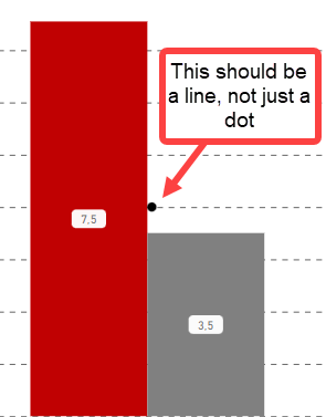
So what I want is a horizontal line going from left to right, or at least over the width of the columns + distance.
But the line is always to short, if I have more columns it appears over maybe 50% of the left and right column, if I have only 2 columns it looks like this. How can I fix this issue?
You must be a registered user to add a comment. If you've already registered, sign in. Otherwise, register and sign in.
- Analyst-Rene on: Drill through results blank when slicer selection ...
-
 v-xiaoyan-msft
on:
Power BI Embedded with DirectLake Dataset Error
- aschkan on: Alarm button in Power BI Service not named correct...
-
 v-yetao1-msft
on:
Unable to create new dataflows Power BI GCC tenant
- OlgaBlesa on: Los filtros Aplicados en un objeto visual no se ac...
-
mmerchak
 on:
Frequent "Cache.Key is denied" Refresh Failure on ...
-
 v-yetao1-msft
on:
Fabric Capacity App fails to load with 'An error o...
-
 v-yetao1-msft
on:
Something went wrong endless loop
-
 v-xiaoyan-msft
on:
Slicer bug?
-
Element115
 on:
BUG::SLICER::IDbConnection interface
- New 7,844
- Needs Info 3,354
- Investigating 3,139
- Accepted 2,036
- Declined 38
- Delivered 3,755
-
Reports
9,674 -
Dashboards
3,905 -
Data Modeling
3,860 -
Gateways
2,043 -
Report Server
2,002 -
APIS and Embedding
1,886 -
Custom Visuals
1,671 -
Content Packs
503 -
Mobile
347 -
Need Help
11 -
Show and Tell
2 -
General Comment
2 -
Tips and Tricks
1 -
Power BI Desktop
1

Hi @SIH007_1
Are you trying to change this to a straight line ? If yes , just change the style to solid in visual formatting .
Best Regards,
Community Support Team _ Ailsa Tao