Fabric Data Days starts November 4th!
Advance your Data & AI career with 50 days of live learning, dataviz contests, hands-on challenges, study groups & certifications and more!
Get registered- Power BI forums
- Get Help with Power BI
- Desktop
- Service
- Report Server
- Power Query
- Mobile Apps
- Developer
- DAX Commands and Tips
- Custom Visuals Development Discussion
- Health and Life Sciences
- Power BI Spanish forums
- Translated Spanish Desktop
- Training and Consulting
- Instructor Led Training
- Dashboard in a Day for Women, by Women
- Galleries
- Data Stories Gallery
- Themes Gallery
- Contests Gallery
- Quick Measures Gallery
- Visual Calculations Gallery
- Notebook Gallery
- Translytical Task Flow Gallery
- TMDL Gallery
- R Script Showcase
- Webinars and Video Gallery
- Ideas
- Custom Visuals Ideas (read-only)
- Issues
- Issues
- Events
- Upcoming Events
Join us at FabCon Atlanta from March 16 - 20, 2026, for the ultimate Fabric, Power BI, AI and SQL community-led event. Save $200 with code FABCOMM. Register now.
- Power BI forums
- Issues
- Issues
- Visual header icons take up same space even with b...
- Subscribe to RSS Feed
- Mark as New
- Mark as Read
- Bookmark
- Subscribe
- Printer Friendly Page
- Report Inappropriate Content
Visual header icons take up same space even with borders and backgrounds 'turned off'
Hi there,
We currently employ a style in Power BI that uses title text (10pt) with a simple dark grey background/bar for each visualization, and as the icons (allowing for background/border) don't fit within it height wise, the lower edge of each icon 'hangs' below the visual title/header bar. Would it be possible to add an option to properly 'turn off' the background and border for the visual header icons (as opposed to just making them transparent, as per the current options), and subsequently have Power BI respect the smaller space they take up within the title bar/background, leading to better spacing/alignment?
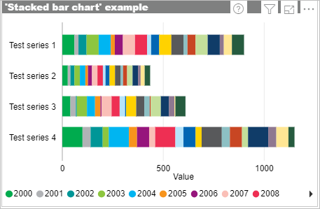
To demonstrate, this is how it appears with the background/border 'switched on' for each icon:
And with the icon background/borders 'off':
Ideally, the icons in the second example should be better aligned/fit to the title bar/background, given the icon borders/backgrounds are no longer visible.
Thanks.
You must be a registered user to add a comment. If you've already registered, sign in. Otherwise, register and sign in.
- Ghoom on: Azure Maps Controls -> Selection Greyed out
- RobSt on: Error:Visuals display blank when export report to ...
-
hb380
 on:
New Button Slicer: Issue with the Grid type of Arr...
-
 mattlee
on:
List Slicer Button Dimensions Ignored in Service
-
bhalicki
 on:
BUG: report connected to deleted semantic model ca...
- Annamarie on: PBI Semantic Model missing
- SeanGTB on: Azure Map visual auto zoom issue with 3D columns
- Ghoom on: Azure map bubble chart is very blurry
-
JoshT
 on:
Deployment pipelines don't support M365 groups
-
 Hongju_Jung
on:
A Typo about Measure tools (Korean)
- New 8,149
- Needs Info 3,502
- Investigating 3,602
- Accepted 2,090
- Declined 38
- Delivered 3,970
-
Reports
10,297 -
Data Modeling
4,170 -
Dashboards
4,129 -
Gateways
2,123 -
Report Server
2,123 -
APIS and Embedding
1,975 -
Custom Visuals
1,800 -
Content Packs
527 -
Mobile
355 -
Need Help
11 -
Show and Tell
3 -
General Comment
3 -
Power BI Desktop
1 -
Tips and Tricks
1

