Join us at the 2025 Microsoft Fabric Community Conference
Microsoft Fabric Community Conference 2025, March 31 - April 2, Las Vegas, Nevada. Use code FABINSIDER for a $400 discount.
Register now- Power BI forums
- Get Help with Power BI
- Desktop
- Service
- Report Server
- Power Query
- Mobile Apps
- Developer
- DAX Commands and Tips
- Custom Visuals Development Discussion
- Health and Life Sciences
- Power BI Spanish forums
- Translated Spanish Desktop
- Training and Consulting
- Instructor Led Training
- Dashboard in a Day for Women, by Women
- Galleries
- Webinars and Video Gallery
- Data Stories Gallery
- Themes Gallery
- Power BI DataViz World Championships Gallery
- Quick Measures Gallery
- R Script Showcase
- COVID-19 Data Stories Gallery
- Community Connections & How-To Videos
- 2021 MSBizAppsSummit Gallery
- 2020 MSBizAppsSummit Gallery
- 2019 MSBizAppsSummit Gallery
- Events
- Ideas
- Custom Visuals Ideas (read-only)
- Issues
- Issues
- Events
- Upcoming Events
The Power BI DataViz World Championships are on! With four chances to enter, you could win a spot in the LIVE Grand Finale in Las Vegas. Show off your skills.
- Power BI forums
- Issues
- Issues
- Recent PBI Service Update: Visual Titles now have ...
- Subscribe to RSS Feed
- Mark as New
- Mark as Read
- Bookmark
- Subscribe
- Printer Friendly Page
- Report Inappropriate Content
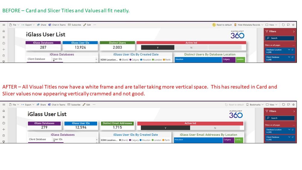
Recent PBI Service Update: Visual Titles now have white frame and are taller; info below is squished
Anyone else experiencing this? The formatting of the visual titles in my report was all good.
Now it is not good any more. There are white frames around the Titles making them taller. Plus, even without these white frames, the Titles themselves are taller. This is causing the information below (i.e. Card Data Labels) to be crammed/squished. The Cards now look mediocre and the Slicer looks terrible.
There was some Power BI Service update late last week that caused this. Below snapshots show BEFORE and AFTER. Such a small change is causing basically all the cards in all my reports to look squished and not good.
- « Previous
-
- 1
- 2
- 3
- Next »
- « Previous
-
- 1
- 2
- 3
- Next »
You must be a registered user to add a comment. If you've already registered, sign in. Otherwise, register and sign in.
-
 suparnababu8
on:
Default Chart - Shape Map Not Working as Expected
- PBIdude on: Power BI Desktop freezes when saving
- jens_galinowski on: dark mode model view delete-info is not readable
- jens_galinowski on: filter slicer changing in height when i change the...
- jens_galinowski on: hold left mouse and using the scrollwheel with gro...
-
 v-xiaoyan-msft
on:
Error applying new column or table
- beom on: an issue that is not applied properly
-
C4YNelis
 on:
Issue with Double CTID (tenant ID) in URL after PU...
-
 v-xiaoyan-msft
on:
Power Automate Visual does not pass on the data, o...
-
 v-xiaoyan-msft
on:
PBI Connect to Excel Workbook on OneDrive - API Re...
- New 7,845
- Needs Info 3,502
- Investigating 3,588
- Accepted 2,084
- Declined 38
- Delivered 3,963
-
Reports
10,125 -
Data Modeling
4,083 -
Dashboards
4,076 -
Gateways
2,099 -
Report Server
2,098 -
APIS and Embedding
1,946 -
Custom Visuals
1,764 -
Content Packs
521 -
Mobile
353 -
Need Help
11 -
Show and Tell
3 -
General Comment
2 -
Tips and Tricks
1 -
Power BI Desktop
1
