Join us at FabCon Vienna from September 15-18, 2025
The ultimate Fabric, Power BI, SQL, and AI community-led learning event. Save €200 with code FABCOMM.
Get registered- Power BI forums
- Get Help with Power BI
- Desktop
- Service
- Report Server
- Power Query
- Mobile Apps
- Developer
- DAX Commands and Tips
- Custom Visuals Development Discussion
- Health and Life Sciences
- Power BI Spanish forums
- Translated Spanish Desktop
- Training and Consulting
- Instructor Led Training
- Dashboard in a Day for Women, by Women
- Galleries
- Data Stories Gallery
- Themes Gallery
- Contests Gallery
- Quick Measures Gallery
- Notebook Gallery
- Translytical Task Flow Gallery
- TMDL Gallery
- R Script Showcase
- Webinars and Video Gallery
- Ideas
- Custom Visuals Ideas (read-only)
- Issues
- Issues
- Events
- Upcoming Events
Compete to become Power BI Data Viz World Champion! First round ends August 18th. Get started.
- Power BI forums
- Issues
- Issues
- CBSA's not rendering correctly in Dashboard
- Subscribe to RSS Feed
- Mark as New
- Mark as Read
- Bookmark
- Subscribe
- Printer Friendly Page
- Report Inappropriate Content
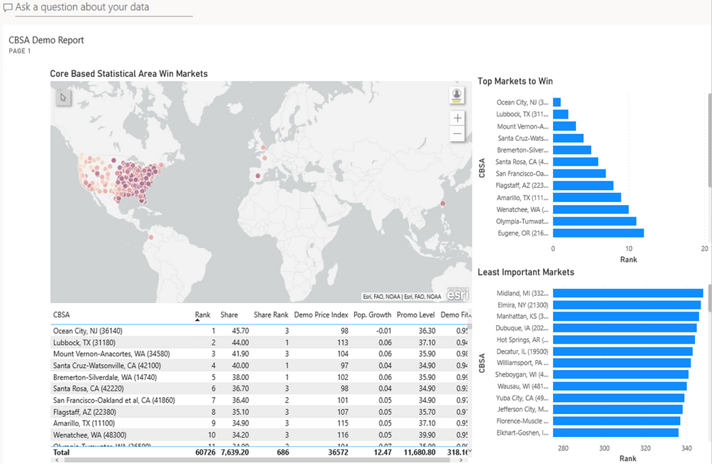
CBSA's not rendering correctly in Dashboard
I am getting a weird rendering issue where after I have made my report the way I want it and pin it to a dashboard to share the matching of CBSA's shifts to indclude international destinations. This is a mismatch. I don't see on the Dashboard how to correct this issue and any insight would be great. I have the pbix, but don't see how to attach it to this idea.
Also I have seen this request before, but I am a big proponent of a color scale that goes Green -> Yellow -> Red for map pins. Can we make that happen?
Thanks!


You must be a registered user to add a comment. If you've already registered, sign in. Otherwise, register and sign in.
- Jstukenborg on: Data on Power BI desktop is not refreshing
- levkro1234 on: Fields Parameter w. hierarchies: provide option to...
- Rabea_Damlakhy on: Critical Bug: Deleting a Visual Group on One Page ...
-
allyklee
 on:
Remove / Copy Visual issue - July 2025 Desktop Iss...
- stipa on: Error "[403.12–403.30] The name 'Lakehouse.Content...
-
klinejordan
 on:
URL is not filtering on field parameter
- MaAl on: "The import PowerPlatform.Dataflows matches no exp...
-
NikNithiy
 on:
URGENT!! Paginated Report not loading on Mozilla F...
- duarte on: Unable to sort months in PowerBI
-
mmyers2
 on:
In desktop, 'Recent Sources' is not retaining new ...
- New 8,074
- Needs Info 3,502
- Investigating 3,602
- Accepted 2,088
- Declined 38
- Delivered 3,970
-
Reports
10,256 -
Data Modeling
4,144 -
Dashboards
4,119 -
Report Server
2,119 -
Gateways
2,117 -
APIS and Embedding
1,969 -
Custom Visuals
1,793 -
Content Packs
525 -
Mobile
354 -
Need Help
11 -
Show and Tell
3 -
General Comment
2 -
Power BI Desktop
1 -
Tips and Tricks
1