Idea Options
- Subscribe to RSS Feed
- Mark as New
- Mark as Read
- Bookmark
- Subscribe
- Printer Friendly Page
- Report Inappropriate Content
Line Chart issues and ideas to improve the line chart visual.
Submitted by
Gopinath_Rajara
on
03-07-2023
12:12 AM
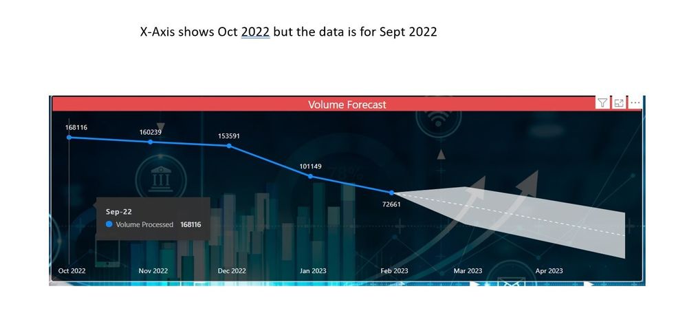
In Line chart, forecasting is available only when the X-axis type selected is "Continuous". When "Categorical" type X-axis is selected the forecasting option is unavailable. There is no option to display labels for the forecasted values, upper and lower confidence levels. In coutinuous type X-axis, the period shown below X-axis is leading 1 period from what the data is shown in the chart. Please enable forecast option with x-axis type categorical as well. Fix the period display when in continuous type x-axis.
See more ideas labeled with:
Comments
You must be a registered user to add a comment. If you've already registered, sign in. Otherwise, register and sign in.
Latest Comments
- pedrodr99 on: Button Slicer - Label - Color change not working
-
 v-xiaoyan-msft
on:
Default Chart - Shape Map Is Not Working As Expect...
-
 v-xiaoyan-msft
on:
Error (Exception from HRESULT: 0x80070002)
-
 v-xiaoyan-msft
on:
Card (new) - SVG images dont render correctly
-
 v-xiaoyan-msft
on:
Can't open my Power BI Report due to this error
- DamoUK on: Refresh failures to Databricks from the PBI Servic...
- helloworld_ on: Tile slicer - "Select all" button acting weird
-
 v-xiaoyan-msft
on:
Bug in new button slicer
- WestAlmighty on: Unable to connect PostgreSQL data mart to PowerBI
-
 v-xiaoyan-msft
on:
Bug: Circular dependency Error with only one Conne...
Idea Statuses
- New 7,856
- Needs Info 3,502
- Investigating 3,602
- Accepted 2,084
- Declined 38
- Delivered 3,964
-
Reports
10,138 -
Data Modeling
4,090 -
Dashboards
4,078 -
Gateways
2,103 -
Report Server
2,098 -
APIS and Embedding
1,948 -
Custom Visuals
1,766 -
Content Packs
521 -
Mobile
353 -
Need Help
11 -
Show and Tell
3 -
General Comment
2 -
Tips and Tricks
1 -
Power BI Desktop
1

