- Power BI forums
- Updates
- News & Announcements
- Get Help with Power BI
- Desktop
- Service
- Report Server
- Power Query
- Mobile Apps
- Developer
- DAX Commands and Tips
- Custom Visuals Development Discussion
- Health and Life Sciences
- Power BI Spanish forums
- Translated Spanish Desktop
- Power Platform Integration - Better Together!
- Power Platform Integrations (Read-only)
- Power Platform and Dynamics 365 Integrations (Read-only)
- Training and Consulting
- Instructor Led Training
- Dashboard in a Day for Women, by Women
- Galleries
- Community Connections & How-To Videos
- COVID-19 Data Stories Gallery
- Themes Gallery
- Data Stories Gallery
- R Script Showcase
- Webinars and Video Gallery
- Quick Measures Gallery
- 2021 MSBizAppsSummit Gallery
- 2020 MSBizAppsSummit Gallery
- 2019 MSBizAppsSummit Gallery
- Events
- Ideas
- Custom Visuals Ideas
- Issues
- Issues
- Events
- Upcoming Events
- Community Blog
- Power BI Community Blog
- Custom Visuals Community Blog
- Community Support
- Community Accounts & Registration
- Using the Community
- Community Feedback
Register now to learn Fabric in free live sessions led by the best Microsoft experts. From Apr 16 to May 9, in English and Spanish.
- Power BI forums
- Community Blog
- Power BI Community Blog
- Localizing the Data Model - Part 3
- Subscribe to RSS Feed
- Mark as New
- Mark as Read
- Bookmark
- Subscribe
- Printer Friendly Page
- Report Inappropriate Content
- Subscribe to RSS Feed
- Mark as New
- Mark as Read
- Bookmark
- Subscribe
- Printer Friendly Page
- Report Inappropriate Content
Introduction
OK, so as I mentioned in Part 1, a user in my user group recently asked me about localizing a Power BI data model including table names, column names, measure names as well as titles for visualization, etc. I figured I'd break this subject up into chunks so there will at least be two parts to this blog article, maybe three or more. In Part 1, we localized the names of tables, columns and measures in our data model. In Part 2, we managed to get testing working using Power BI Premium and used a localization table and measures to solve for localized titles. However, because axis titles and legends do not have the magical fx button, we couldn't localize those things and we identified an issue with the actual translation of things like month names that were in the data itself. Let's pick up where we left off.
The Easy Way
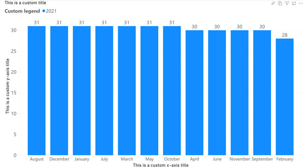
Browser translation. You see, all modern browsers have the capability of translating a page in a foreign language. So, to test this, I created a completely unlocalized copy of my report, which looks like this in English:
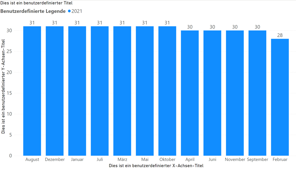
So I created custom axis titles, legend, visual title, etc. Now I simply asked Edge to translate the page to German and here is the result:
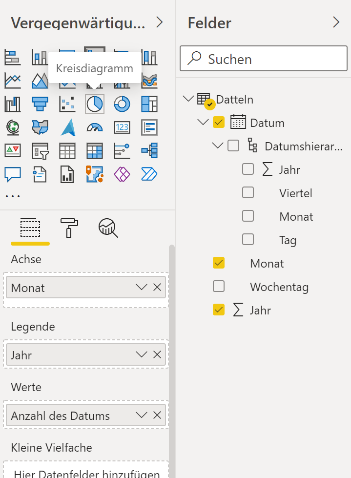
I don't know much, if any German, but this looks reasonable to me. And hey, it even translated the names of my months to German as well. This means that the data within my model can be translated to other languages automatically! That's pretty fancy! Better yet, when I edit my report, even my Visualizations and Fields panes are translated to German:
And mind you, this works in either Pro or Premium so no need for Premium at all if you use the browser's translation feature!
So, are we done? I'm going to say "yes" for all practical purposes because if you don't use this technique, things start to become infinitely more difficult. Besides, this solution is "elegant". Why reinvent the wheel when people have already put so much time and effort into translation technology that simply requires a bit of user education to learn how to use? No need to translate anything and no need for Premium!
The Hard Way
OK, to demonstrate just how difficult this becomes if we don't use browser translation, let's first tackle what options we have for those text elements that do not include the fx button. Well, we could theoretically use our localization table and measures to create Card visuals that displayed the correct localized text and overlay the appropriate visual elements. But, that's not exactly an elegant solution. And, since you can't rotate Card visuals, you really don't have any options for your y-axis title. And how exactly do you account for things like Legend text that is significantly shorter or longer in one language versus another?
And what about translating the actual data like the weekday and month names? That's even more of a pain. The first thought I had was what if I built a simple table of just the month names with additional columns for each localization. I could relate this to my Dates table and then build a hiearchy for the x-axis of each of the month name columns and then use Object Level Security (OLS) so that only one of the columns could be read... Let me be clear, this does not work in the slightest. Oh OLS, you useless, useless, trash feature you. OLS, you have failed me for the last time!! You see, the minute Power BI attempts to display a visual for which a column "doesn't exist", it does not handle the issue gracefully, you just get a broken visual. And thus, why OLS is essentially a useless "feature".
Oh well, let's try something else and to make this just a tad more realistic, let's create a quick Facts table and set the Value column to Currency (Currency General):
Facts =
    VAR __Table = ADDCOLUMNS('Dates',"Value",YEAR([Date])+MONTH([Date])+DAY([Date]))
RETURN
    UNION(__Table, __Table, __Table)
We now create a "Dates2" table like this:
Dates2 =
    UNION(
        ADDCOLUMNS(
            'Dates',
            "Language","en-US"
        ),
        SELECTCOLUMNS(
            ADDCOLUMNS(
                'Dates',
                "Language","de-DE",
                "German Month",
                    SWITCH([Month],
                        "January","Januar",
                        "February","Februar",
                        "March","Marz",
                        "April","April",
                        "May","Mai",
                        "June","Juni",
                        "July","Juli",
                        "August","August",
                        "September","September",
                        "October","Oktober",
                        "November","November",
                        "December","December"
                    )
            ),
            "Date",[Date],
            "Month",[German Month],
            "Weekday",[Weekday],
            "Year",[Year],
            "Language",[Language]
        )
    )
So now our Dates2 table has 2 rows for every date that either has an English language month name or a German language month name as well as a Languae column that specifies which language is used in the row. We create the relationship between the two tables and it is Many-to-Many. Ok, Many-to-Many is not the end of the world, we setup two RLS roles, English and German which essentially have RLS rules like:
[Language] = "de-DE"
And we test and it works. Sure, it looks a little strange if you don't use an RLS rule with both English and German month names being in the axis but we could just enforce the rule that everyone needs to be a member of an RLS role. But, it works for an extremely simple data model. I can't imagine trying to do this technique for any kind of complex data model.
Conclusion
Browser translation is your friend.
You must be a registered user to add a comment. If you've already registered, sign in. Otherwise, register and sign in.
- Administering Microsoft Fabric: Strategies and Rea...
- Optimizing DAX in Power BI: A Comprehensive How-To...
- Mastering the Art of Storytelling with Power BI Co...
- Dynamic rollback of the previous N weeks of data
- Supercharge Your Visuals: Easy Conditional Formatt...
- The using of Cartesian products in many-to-many re...
- How to Filter similar Columns Based on Specific Co...
- Power BI Dynamic Date Filters: Automatically Updat...
- Enhanced Data Profiling in Power Query: GUI and Ta...
- How to use Tooltip to display breakdown data for a...
-
 Fowmy
on:
Supercharge Your Visuals: Easy Conditional Formatt...
-
marcoselias
 on:
Power BI Dynamic Date Filters: Automatically Updat...
- joseftantawi on: How to customize open-sourced custom visual.
- kalpeshdangar on: Creating Custom Calendars for Accurate Working Day...
- gwayne on: Embracing TMDL Functionalities in Power BI and Pre...
- jian123 on: Sharing Power Query tables
-
 Martin_D
on:
From the Desk of An Experienced Power BI Analyst
-
 ibarrau
on:
[PowerQuery] Catch errors in a request http
- Aditya07 on: How to import customised themes in Power BI - usin...
-
 Martin_D
on:
Currency Conversion in Power BI: Enabling Seamless...
-
How To
576 -
Tips & Tricks
529 -
Support insights
121 -
Events
107 -
DAX
66 -
Opinion
65 -
Power BI
65 -
Power Query
62 -
Power BI Desktop
40 -
Power BI Dev Camp
36 -
Roundup
32 -
Power BI Embedded
20 -
Time Intelligence
19 -
Tips&Tricks
18 -
PowerBI REST API
12 -
Power Query Tips & Tricks
8 -
finance
8 -
Power BI Service
8 -
Direct Query
7 -
Power BI REST API
6 -
Auto ML
6 -
financial reporting
6 -
Data Analysis
6 -
Power Automate
6 -
Data Visualization
6 -
Python
6 -
Machine Learning
5 -
Featured User Group Leader
5 -
Dax studio
5 -
Income Statement
5 -
powerbi
5 -
service
5 -
Power BI PowerShell
5 -
Line chart
4 -
community
4 -
RLS
4 -
M language
4 -
External tool
4 -
Paginated Reports
4 -
Power BI Goals
4 -
PowerShell
4 -
Desktop
4 -
Bookmarks
4 -
Group By
4 -
Data Science
3 -
Azure
3 -
Data model
3 -
Conditional Formatting
3 -
Visualisation
3 -
Administration
3 -
M code
3 -
SQL Server 2017 Express Edition
3 -
Visuals
3 -
R script
3 -
Aggregation
3 -
Dataflow
3 -
calendar
3 -
Gateways
3 -
R
3 -
M Query
3 -
R visual
3 -
Webinar
3 -
CALCULATE
3 -
Reports
3 -
PowerApps
3 -
rank
2 -
ladataweb
2 -
Tips and Tricks
2 -
Incremental Refresh
2 -
Query Plans
2 -
Power BI & Power Apps
2 -
Random numbers
2 -
Day of the Week
2 -
Number Ranges
2 -
M
2 -
hierarchies
2 -
Power BI Anniversary
2 -
Language M
2 -
Custom Visual
2 -
VLOOKUP
2 -
pivot
2 -
calculated column
2 -
Power BI Premium Per user
2 -
inexact
2 -
Date Comparison
2 -
Split
2 -
Forecasting
2 -
REST API
2 -
Editor
2 -
Working with Non Standatd Periods
2 -
powerbi.tips
2 -
Custom function
2 -
Reverse
2 -
measure
2 -
Microsoft-flow
2 -
Paginated Report Builder
2 -
PUG
2 -
Custom Measures
2 -
Filtering
2 -
Row and column conversion
2 -
Python script
2 -
Nulls
2 -
DVW Analytics
2 -
Industrial App Store
2 -
Week
2 -
Date duration
2 -
parameter
2 -
Weekday Calendar
2 -
Support insights.
2 -
construct list
2 -
Formatting
2 -
Power Platform
2 -
Workday
2 -
external tools
2 -
slicers
2 -
SAP
2 -
index
2 -
RANKX
2 -
Integer
2 -
PBI Desktop
2 -
Date Dimension
2 -
Power BI Challenge
2 -
Query Parameter
2 -
Visualization
2 -
Tabular Editor
2 -
Date
2 -
SharePoint
2 -
Power BI Installation and Updates
2 -
How Things Work
2 -
troubleshooting
2 -
Date DIFF
2 -
Transform data
2 -
Excel
1 -
Cumulative Totals
1 -
Report Theme
1 -
Bookmarking
1 -
oracle
1 -
Canvas Apps
1 -
total
1 -
Filter context
1 -
Difference between two dates
1 -
get data
1 -
OSI
1 -
Query format convert
1 -
ETL
1 -
Json files
1 -
Merge Rows
1 -
CONCATENATEX()
1 -
take over Datasets;
1 -
Networkdays.Intl
1 -
Get row and column totals
1 -
Sameperiodlastyear
1 -
Office Theme
1 -
matrix
1 -
bar chart
1 -
Measures
1 -
powerbi argentina
1 -
Model Driven Apps
1 -
REMOVEFILTERS
1 -
XMLA endpoint
1 -
translations
1 -
OSI pi
1 -
Parquet
1 -
Change rows to columns
1 -
remove spaces
1 -
Azure AAD
1 -
Governance
1 -
Fun
1 -
Power BI gateway
1 -
gateway
1 -
Elementary
1 -
Custom filters
1 -
Vertipaq Analyzer
1 -
powerbi cordoba
1 -
DIisconnected Tables
1 -
Sandbox
1 -
Honeywell
1 -
Combine queries
1 -
X axis at different granularity
1 -
ADLS
1 -
Primary Key
1 -
Microsoft 365 usage analytics data
1 -
Randomly filter
1 -
Week of the Day
1 -
Get latest sign-in data for each user
1 -
Retail
1 -
Power BI Report Server
1 -
School
1 -
Cost-Benefit Analysis
1 -
ISV
1 -
Ties
1 -
unpivot
1 -
Practice Model
1 -
Continuous streak
1 -
ProcessVue
1 -
Create function
1 -
Table.Schema
1 -
Acknowledging
1 -
Postman
1 -
Text.ContainsAny
1 -
Power BI Show
1 -
query
1 -
Dynamic Visuals
1 -
KPI
1 -
Intro
1 -
Icons
1 -
Issues
1 -
function
1 -
stacked column chart
1 -
ho
1 -
ABB
1 -
KNN algorithm
1 -
List.Zip
1 -
optimization
1 -
Artificial Intelligence
1 -
Map Visual
1 -
Text.ContainsAll
1 -
Tuesday
1 -
API
1 -
Kingsley
1 -
Merge
1 -
variable
1 -
financial reporting hierarchies RLS
1 -
Featured Data Stories
1 -
MQTT
1 -
Custom Periods
1 -
Partial group
1 -
Reduce Size
1 -
FBL3N
1 -
Wednesday
1 -
help
1 -
group
1 -
Scorecard
1 -
Json
1 -
Tops
1 -
Multivalued column
1 -
pipeline
1 -
Path
1 -
Yokogawa
1 -
Dynamic calculation
1 -
Data Wrangling
1 -
native folded query
1 -
transform table
1 -
UX
1 -
Cell content
1 -
General Ledger
1 -
Thursday
1 -
Power Pivot
1 -
Quick Tips
1 -
data
1 -
PBIRS
1 -
Usage Metrics in Power BI
1 -
HR Analytics
1 -
keepfilters
1 -
Connect Data
1 -
Financial Year
1 -
Schneider
1 -
dynamically delete records
1 -
Copy Measures
1 -
Friday
1 -
Table
1 -
Natural Query Language
1 -
Infographic
1 -
automation
1 -
Prediction
1 -
newworkspacepowerbi
1 -
Performance KPIs
1 -
Active Employee
1 -
Custom Date Range on Date Slicer
1 -
refresh error
1 -
PAS
1 -
certain duration
1 -
DA-100
1 -
bulk renaming of columns
1 -
Single Date Picker
1 -
Monday
1 -
PCS
1 -
Saturday
1 -
Q&A
1 -
Event
1 -
Custom Visuals
1 -
Free vs Pro
1 -
Format
1 -
Current Employees
1 -
date hierarchy
1 -
relationship
1 -
SIEMENS
1 -
Multiple Currency
1 -
Power BI Premium
1 -
On-premises data gateway
1 -
Binary
1 -
Power BI Connector for SAP
1 -
Sunday
1 -
update
1 -
Slicer
1 -
Visual
1 -
forecast
1 -
Regression
1 -
CICD
1 -
sport statistics
1 -
Intelligent Plant
1 -
Circular dependency
1 -
GE
1 -
Exchange rate
1 -
Dendrogram
1 -
range of values
1 -
activity log
1 -
Decimal
1 -
Charticulator Challenge
1 -
Field parameters
1 -
Training
1 -
Announcement
1 -
Features
1 -
domain
1 -
pbiviz
1 -
Color Map
1 -
Industrial
1 -
Weekday
1 -
Working Date
1 -
Space Issue
1 -
Emerson
1 -
Date Table
1 -
Cluster Analysis
1 -
Stacked Area Chart
1 -
union tables
1 -
Number
1 -
Start of Week
1 -
Tips& Tricks
1 -
deployment
1 -
ssrs traffic light indicators
1 -
SQL
1 -
trick
1 -
Scripts
1 -
Extract
1 -
Topper Color On Map
1 -
Historians
1 -
context transition
1 -
Custom textbox
1 -
OPC
1 -
Zabbix
1 -
Label: DAX
1 -
Business Analysis
1 -
Supporting Insight
1 -
rank value
1 -
Synapse
1 -
End of Week
1 -
Tips&Trick
1 -
Workspace
1 -
Theme Colours
1 -
Text
1 -
Flow
1 -
Publish to Web
1 -
patch
1 -
Top Category Color
1 -
A&E data
1 -
Previous Order
1 -
Substring
1 -
Wonderware
1 -
Power M
1 -
Format DAX
1 -
Custom functions
1 -
accumulative
1 -
DAX&Power Query
1 -
Premium Per User
1 -
GENERATESERIES
1 -
Showcase
1 -
custom connector
1 -
Waterfall Chart
1 -
Power BI On-Premise Data Gateway
1 -
step by step
1 -
Top Brand Color on Map
1 -
Tutorial
1 -
Previous Date
1 -
XMLA End point
1 -
color reference
1 -
Date Time
1 -
Marker
1 -
Lineage
1 -
CSV file
1 -
conditional accumulative
1 -
Matrix Subtotal
1 -
Check
1 -
null value
1 -
Report Server
1 -
Audit Logs
1 -
analytics pane
1 -
mahak
1 -
pandas
1 -
Networkdays
1 -
Button
1 -
Dataset list
1 -
Keyboard Shortcuts
1 -
Fill Function
1 -
LOOKUPVALUE()
1 -
Tips &Tricks
1 -
Plotly package
1 -
refresh M language Python script Support Insights
1
- 05-05-2024 - 05-06-2024
- 04-28-2024 - 05-04-2024
- 04-14-2024 - 04-20-2024
- 04-07-2024 - 04-13-2024
- 03-24-2024 - 03-30-2024
- 03-17-2024 - 03-23-2024
- 03-10-2024 - 03-16-2024
- 03-03-2024 - 03-09-2024
- 02-25-2024 - 03-02-2024
- 02-18-2024 - 02-24-2024
- 02-11-2024 - 02-17-2024
- 02-04-2024 - 02-10-2024
- View Complete Archives


