Get certified for free when you join Fabric Data Days 2026 and dive into Fabric, Power BI, SQL, AI, and other essential data skills.
Join nowJuly 28 - August 9 | Final Round of the Power BI Dataviz World Championships. This is your chance. Learn more
Hi Power BI Community
I am having some issues with the Line Chart visual in Power BI. The trouble is that there is a difference between how the graph is displayed in Power BI Desktop and app.powerbi.com.
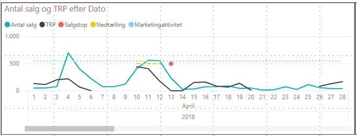
In Power BI Desktop my Line Chart the black line is disjointed when there are days with no data (this is what I want it to look like).
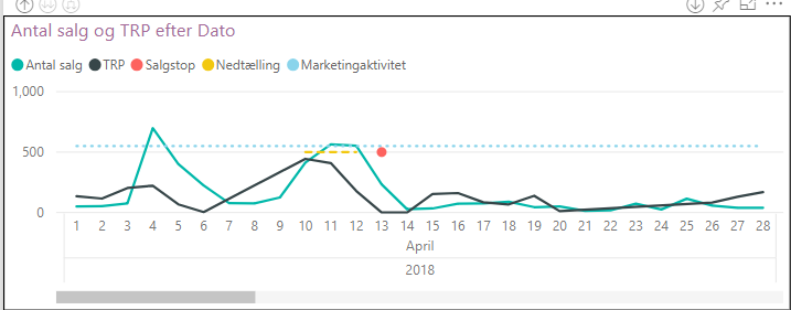
However, when uploading the report to app.powerbi.com the black line is no longer disjointed.
See below images:
Power BI Desktopd
app.powerbi.com
Does any of you know why there is this difference between the two?
Many thanks beforehand!
Hi @andershh
A similar problem has been reported, after testing and discussing, we could raise the following summary:
By Design, new charts with numeric axes will pick "continuous" which will generate linear spaced tick marks (e.g. 0, 5, 10, 15 ... 30). If an existing chart changed, perhaps the axis type was still undefined and a modeling change caused the "week number" field to change from "text" to "numeric". This is not a product bug, something must have changed in the model or report and the default behavior worked as expected.
Could you check you setting for your chart and make some changes, perhaps set the axis type to categorical and update the sort?
Best regards
Maggie
Looks like some sort of bug one way or the other. I'd report it to Issues.
If you love stickers, then you will definitely want to check out our community sticker challenge, Barcelona edition!
Check out the July 2026 Power BI update to learn about new features.
| User | Count |
|---|---|
| 10 | |
| 10 | |
| 9 | |
| 9 | |
| 5 |