A new Data Days event is coming soon!
This time we’re going bigger than ever. Fabric, Power BI, SQL, AI and more. We're covering it all. You won't want to miss it.
Learn more- Power BI forums
- Get Help with Power BI
- Desktop
- Service
- Report Server
- Power Query
- Mobile Apps
- Developer
- DAX Commands and Tips
- Custom Visuals Development Discussion
- Health and Life Sciences
- Power BI Spanish forums
- Translated Spanish Desktop
- Training and Consulting
- Instructor Led Training
- Dashboard in a Day for Women, by Women
- Galleries
- Data Stories Gallery
- Themes Gallery
- Contests Gallery
- QuickViz Gallery
- Quick Measures Gallery
- Visual Calculations Gallery
- Notebook Gallery
- Translytical Task Flow Gallery
- TMDL Gallery
- R Script Showcase
- Webinars and Video Gallery
- Ideas
- Custom Visuals Ideas (read-only)
- Issues
- Issues
- Events
- Upcoming Events
Did you hear? There's a new SQL AI Developer certification (DP-800). Start preparing now and be one of the first to get certified. Register now
- Power BI forums
- Forums
- Get Help with Power BI
- Service
- Re: Difference in Line Chart visualization between...
- Subscribe to RSS Feed
- Mark Topic as New
- Mark Topic as Read
- Float this Topic for Current User
- Bookmark
- Subscribe
- Printer Friendly Page
- Mark as New
- Bookmark
- Subscribe
- Mute
- Subscribe to RSS Feed
- Permalink
- Report Inappropriate Content
Difference in Line Chart visualization between Power BI Desktop and app.powerbi.com
Hi Power BI Community
I am having some issues with the Line Chart visual in Power BI. The trouble is that there is a difference between how the graph is displayed in Power BI Desktop and app.powerbi.com.
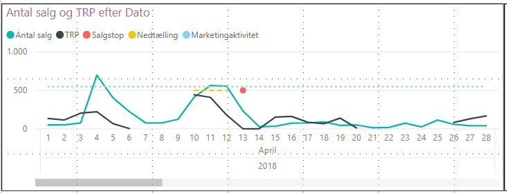
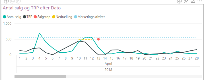
In Power BI Desktop my Line Chart the black line is disjointed when there are days with no data (this is what I want it to look like).
However, when uploading the report to app.powerbi.com the black line is no longer disjointed.
See below images:


Does any of you know why there is this difference between the two?
Many thanks beforehand!
- Mark as New
- Bookmark
- Subscribe
- Mute
- Subscribe to RSS Feed
- Permalink
- Report Inappropriate Content
Hi @andershh
A similar problem has been reported, after testing and discussing, we could raise the following summary:
By Design, new charts with numeric axes will pick "continuous" which will generate linear spaced tick marks (e.g. 0, 5, 10, 15 ... 30). If an existing chart changed, perhaps the axis type was still undefined and a modeling change caused the "week number" field to change from "text" to "numeric". This is not a product bug, something must have changed in the model or report and the default behavior worked as expected.
Could you check you setting for your chart and make some changes, perhaps set the axis type to categorical and update the sort?
Best regards
Maggie
- Mark as New
- Bookmark
- Subscribe
- Mute
- Subscribe to RSS Feed
- Permalink
- Report Inappropriate Content
Looks like some sort of bug one way or the other. I'd report it to Issues.
Follow on LinkedIn
@ me in replies or I'll lose your thread!!!
Instead of a Kudo, please vote for this idea
Become an expert!: Enterprise DNA
External Tools: MSHGQM
YouTube Channel!: Microsoft Hates Greg
Latest book!: DAX For Humans
DAX is easy, CALCULATE makes DAX hard...
Helpful resources

Power BI Monthly Update - April 2026
Check out the April 2026 Power BI update to learn about new features.

Data Days 2026 coming soon!
Sign up to receive a private message when registration opens and key events begin.

New to Fabric Survey
If you have recently started exploring Fabric, we'd love to hear how it's going. Your feedback can help with product improvements.

| User | Count |
|---|---|
| 10 | |
| 8 | |
| 7 | |
| 7 | |
| 7 |
| User | Count |
|---|---|
| 49 | |
| 27 | |
| 21 | |
| 20 | |
| 20 |
