Hello,
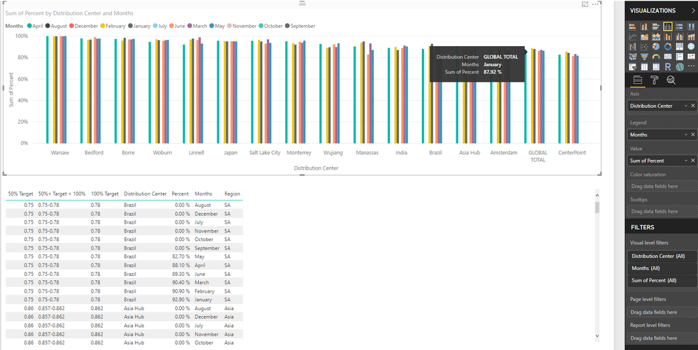
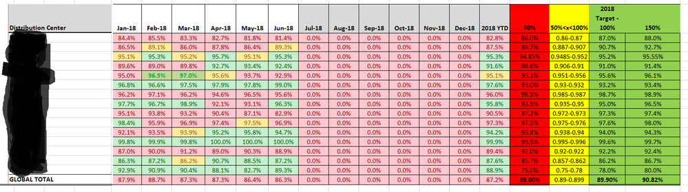
I want to color code my data given certain criteria. In my case I want to code based off of the following criteria. If percent is equal to or less than 50% color red, if percent is greater than 50% or less than 100% color yellow, and if percent is equal to or greater than 100% color green. The catch is each point on the x-axis, in this case the points represent different locations, have their own values for what is 50%, 50<100, and 100%. For example, 89% percent complete might only represent 50% percent efficeny which would result in a color code of red. I'm not sure if I have explained myself clearly, but I have attached the way my data looks in Power BI below in case that provides more clarity. I have also attached a excel table below. I want to color code a graph in power bi the way that table is color coded on a location by location basis.
Thanks,
David