Get Fabric certified for FREE!
Don't miss your chance to take the Fabric Data Engineer (DP-600) exam for FREE! Find out how by attending the DP-600 session on April 23rd (pacific time), live or on-demand.
Learn more- Power BI forums
- Get Help with Power BI
- Desktop
- Service
- Report Server
- Power Query
- Mobile Apps
- Developer
- DAX Commands and Tips
- Custom Visuals Development Discussion
- Health and Life Sciences
- Power BI Spanish forums
- Translated Spanish Desktop
- Training and Consulting
- Instructor Led Training
- Dashboard in a Day for Women, by Women
- Galleries
- Data Stories Gallery
- Themes Gallery
- Contests Gallery
- QuickViz Gallery
- Quick Measures Gallery
- Visual Calculations Gallery
- Notebook Gallery
- Translytical Task Flow Gallery
- TMDL Gallery
- R Script Showcase
- Webinars and Video Gallery
- Ideas
- Custom Visuals Ideas (read-only)
- Issues
- Issues
- Events
- Upcoming Events
Next up in the FabCon + SQLCon recap series: The roadmap for Microsoft SQL and Maximizing Developer experiences in Fabric. All sessions are available on-demand after the live show. Register now
- Power BI forums
- Forums
- Get Help with Power BI
- Desktop
- Conditional Formatting help
- Subscribe to RSS Feed
- Mark Topic as New
- Mark Topic as Read
- Float this Topic for Current User
- Bookmark
- Subscribe
- Printer Friendly Page
- Mark as New
- Bookmark
- Subscribe
- Mute
- Subscribe to RSS Feed
- Permalink
- Report Inappropriate Content
Conditional Formatting help
Hello,
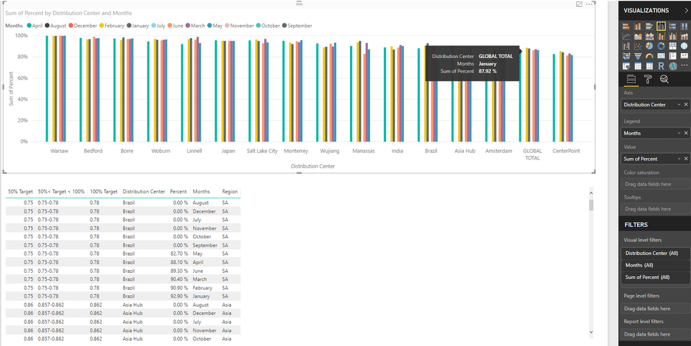
I want to color code my data given certain criteria. In my case I want to code based off of the following criteria. If percent is equal to or less than 50% color red, if percent is greater than 50% or less than 100% color yellow, and if percent is equal to or greater than 100% color green. The catch is each point on the x-axis, in this case the points represent different locations, have their own values for what is 50%, 50<100, and 100%. For example, 89% percent complete might only represent 50% percent efficeny which would result in a color code of red. I'm not sure if I have explained myself clearly, but I have attached the way my data looks in Power BI below in case that provides more clarity. I have also attached a excel table below. I want to color code a graph in power bi the way that table is color coded on a location by location basis.
Thanks,
David
Solved! Go to Solution.
- Mark as New
- Bookmark
- Subscribe
- Mute
- Subscribe to RSS Feed
- Permalink
- Report Inappropriate Content
@dbtornell,
There is no method to set the same formatting as that in Excel. However, you can check the workaournd in the attached PBIX file.
Regards,
Lydia
- Mark as New
- Bookmark
- Subscribe
- Mute
- Subscribe to RSS Feed
- Permalink
- Report Inappropriate Content
@dbtornell,
There is no method to set the same formatting as that in Excel. However, you can check the workaournd in the attached PBIX file.
Regards,
Lydia
Helpful resources

New to Fabric Survey
If you have recently started exploring Fabric, we'd love to hear how it's going. Your feedback can help with product improvements.

Power BI DataViz World Championships - June 2026
A new Power BI DataViz World Championship is coming this June! Don't miss out on submitting your entry.

FabCon &SQLCon Highlights
Experience the highlights from FabCon & SQLCon, available live and on-demand starting April 14th.

| User | Count |
|---|---|
| 47 | |
| 44 | |
| 40 | |
| 20 | |
| 15 |
| User | Count |
|---|---|
| 70 | |
| 68 | |
| 32 | |
| 27 | |
| 25 |


