FabCon is coming to Atlanta
Join us at FabCon Atlanta from March 16 - 20, 2026, for the ultimate Fabric, Power BI, AI and SQL community-led event. Save $200 with code FABCOMM.
Register now!- Power BI forums
- Get Help with Power BI
- Desktop
- Service
- Report Server
- Power Query
- Mobile Apps
- Developer
- DAX Commands and Tips
- Custom Visuals Development Discussion
- Health and Life Sciences
- Power BI Spanish forums
- Translated Spanish Desktop
- Training and Consulting
- Instructor Led Training
- Dashboard in a Day for Women, by Women
- Galleries
- Data Stories Gallery
- Themes Gallery
- Contests Gallery
- Quick Measures Gallery
- Notebook Gallery
- Translytical Task Flow Gallery
- TMDL Gallery
- R Script Showcase
- Webinars and Video Gallery
- Ideas
- Custom Visuals Ideas (read-only)
- Issues
- Issues
- Events
- Upcoming Events
To celebrate FabCon Vienna, we are offering 50% off select exams. Ends October 3rd. Request your discount now.
- Power BI forums
- Forums
- Get Help with Power BI
- DAX Commands and Tips
- Re: Need help with Daily Resource Loading for Prod...
- Subscribe to RSS Feed
- Mark Topic as New
- Mark Topic as Read
- Float this Topic for Current User
- Bookmark
- Subscribe
- Printer Friendly Page
- Mark as New
- Bookmark
- Subscribe
- Mute
- Subscribe to RSS Feed
- Permalink
- Report Inappropriate Content
Need help with Daily Resource Loading for Production Elements (DAX to calculate load per day)
Hello,
From our ERP system I have data on:
[Resource Name] (Machine Centre)
[Project Name]
[Start Date]
[End Date]
# of [Hrs of Work] required
I am trying to make a stacked bar chart that shows each day, with a slicer to filter per [Resource Name], showing which projects are being processed on on the days shown.
Right now I can make a stacked bar with all of the work showing up on the [End Date], but what I need to do is divide the [Hours of work] between the [start date] and the [end date], thus showing how much work is to be done on each project per day.
Thanks,
Solved! Go to Solution.
- Mark as New
- Bookmark
- Subscribe
- Mute
- Subscribe to RSS Feed
- Permalink
- Report Inappropriate Content
- Mark as New
- Bookmark
- Subscribe
- Mute
- Subscribe to RSS Feed
- Permalink
- Report Inappropriate Content
- Mark as New
- Bookmark
- Subscribe
- Mute
- Subscribe to RSS Feed
- Permalink
- Report Inappropriate Content
Thanks amitchandak,
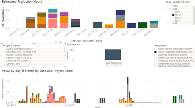
I was able to get the solution to work with some fine tuning. Top graph is what I had before and bottom graph is what I was able to cut it into in terms of daily resource use. Much appreciated!!
- Mark as New
- Bookmark
- Subscribe
- Mute
- Subscribe to RSS Feed
- Permalink
- Report Inappropriate Content
Thanks amitchandak, got the date table working but having trouble with the formulas to assign a volume of work per date. Will continue to work on.
Helpful resources
| User | Count |
|---|---|
| 15 | |
| 9 | |
| 8 | |
| 6 | |
| 5 |
| User | Count |
|---|---|
| 31 | |
| 18 | |
| 15 | |
| 7 | |
| 5 |


