FabCon is coming to Atlanta
Join us at FabCon Atlanta from March 16 - 20, 2026, for the ultimate Fabric, Power BI, AI and SQL community-led event. Save $200 with code FABCOMM.
Register now!- Power BI forums
- Get Help with Power BI
- Desktop
- Service
- Report Server
- Power Query
- Mobile Apps
- Developer
- DAX Commands and Tips
- Custom Visuals Development Discussion
- Health and Life Sciences
- Power BI Spanish forums
- Translated Spanish Desktop
- Training and Consulting
- Instructor Led Training
- Dashboard in a Day for Women, by Women
- Galleries
- Data Stories Gallery
- Themes Gallery
- Contests Gallery
- QuickViz Gallery
- Quick Measures Gallery
- Visual Calculations Gallery
- Notebook Gallery
- Translytical Task Flow Gallery
- TMDL Gallery
- R Script Showcase
- Webinars and Video Gallery
- Ideas
- Custom Visuals Ideas (read-only)
- Issues
- Issues
- Events
- Upcoming Events
The Power BI Data Visualization World Championships is back! Get ahead of the game and start preparing now! Learn more
- Power BI forums
- Forums
- Get Help with Power BI
- DAX Commands and Tips
- Need help with Daily Resource Loading for Producti...
- Subscribe to RSS Feed
- Mark Topic as New
- Mark Topic as Read
- Float this Topic for Current User
- Bookmark
- Subscribe
- Printer Friendly Page
- Mark as New
- Bookmark
- Subscribe
- Mute
- Subscribe to RSS Feed
- Permalink
- Report Inappropriate Content
Need help with Daily Resource Loading for Production Elements (DAX to calculate load per day)
Hello,
From our ERP system I have data on:
[Resource Name] (Machine Centre)
[Project Name]
[Start Date]
[End Date]
# of [Hrs of Work] required
I am trying to make a stacked bar chart that shows each day, with a slicer to filter per [Resource Name], showing which projects are being processed on on the days shown.
Right now I can make a stacked bar with all of the work showing up on the [End Date], but what I need to do is divide the [Hours of work] between the [start date] and the [end date], thus showing how much work is to be done on each project per day.
Thanks,
Solved! Go to Solution.
- Mark as New
- Bookmark
- Subscribe
- Mute
- Subscribe to RSS Feed
- Permalink
- Report Inappropriate Content
- Mark as New
- Bookmark
- Subscribe
- Mute
- Subscribe to RSS Feed
- Permalink
- Report Inappropriate Content
- Mark as New
- Bookmark
- Subscribe
- Mute
- Subscribe to RSS Feed
- Permalink
- Report Inappropriate Content
Thanks amitchandak,
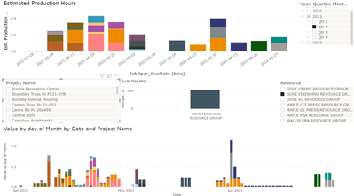
I was able to get the solution to work with some fine tuning. Top graph is what I had before and bottom graph is what I was able to cut it into in terms of daily resource use. Much appreciated!!
- Mark as New
- Bookmark
- Subscribe
- Mute
- Subscribe to RSS Feed
- Permalink
- Report Inappropriate Content
Thanks amitchandak, got the date table working but having trouble with the formulas to assign a volume of work per date. Will continue to work on.
Helpful resources

Power BI Dataviz World Championships
The Power BI Data Visualization World Championships is back! Get ahead of the game and start preparing now!

| User | Count |
|---|---|
| 13 | |
| 5 | |
| 5 | |
| 3 | |
| 3 |
| User | Count |
|---|---|
| 25 | |
| 10 | |
| 10 | |
| 6 | |
| 6 |


