FabCon is coming to Atlanta
Join us at FabCon Atlanta from March 16 - 20, 2026, for the ultimate Fabric, Power BI, AI and SQL community-led event. Save $200 with code FABCOMM.
Register now!- Power BI forums
- Get Help with Power BI
- Desktop
- Service
- Report Server
- Power Query
- Mobile Apps
- Developer
- DAX Commands and Tips
- Custom Visuals Development Discussion
- Health and Life Sciences
- Power BI Spanish forums
- Translated Spanish Desktop
- Training and Consulting
- Instructor Led Training
- Dashboard in a Day for Women, by Women
- Galleries
- Data Stories Gallery
- Themes Gallery
- Contests Gallery
- QuickViz Gallery
- Quick Measures Gallery
- Visual Calculations Gallery
- Notebook Gallery
- Translytical Task Flow Gallery
- TMDL Gallery
- R Script Showcase
- Webinars and Video Gallery
- Ideas
- Custom Visuals Ideas (read-only)
- Issues
- Issues
- Events
- Upcoming Events
Get Fabric Certified for FREE during Fabric Data Days. Don't miss your chance! Request now
- Power BI forums
- Forums
- Get Help with Power BI
- Service
- Re: How do you change the data label number format...
- Subscribe to RSS Feed
- Mark Topic as New
- Mark Topic as Read
- Float this Topic for Current User
- Bookmark
- Subscribe
- Printer Friendly Page
- Mark as New
- Bookmark
- Subscribe
- Mute
- Subscribe to RSS Feed
- Permalink
- Report Inappropriate Content
How do you change the data label number format in Power BI Charts?
I can't seem to find out how to change the number formatting for data labels in Power BI charts. It seems to only have the format of "#.##k" (e.g. 100,000 is displayed as 100k).
I have to be overlooking something; this can't be the only data label number format...
Thanks for your help!
Solved! Go to Solution.
- Mark as New
- Bookmark
- Subscribe
- Mute
- Subscribe to RSS Feed
- Permalink
- Report Inappropriate Content
I tried the following with one of my calcuations in "Power BI Desktop" and I was able to get the type of formatting that you were looking for vs. the default #.##K type formatting you had in your screenshot. Unfortuneatly that only works for card style tyles since it changes the numeric format to text (And text style calcs can't be used in bar graphs and other charts)
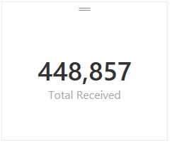
Total Received = FORMAT(SUM(Receipts[Receipts]),"#,###") -- This measure formula rendered like this:
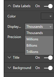
Based on the current version the only changes you can make to label formatting for measures are the following:
Hope this helped. I would expect that we'll see more control for formatting in a future build at some point although I don't know when that will happen.
- Mark as New
- Bookmark
- Subscribe
- Mute
- Subscribe to RSS Feed
- Permalink
- Report Inappropriate Content
Format Roller > Data Labels On > Display > None
I am using Power BI with the November 2017 update.
Stacked Column Chart Example
Shows the full number (1276) but I could not find a way to add the comma, (1,276).
- Mark as New
- Bookmark
- Subscribe
- Mute
- Subscribe to RSS Feed
- Permalink
- Report Inappropriate Content
Hi,
On the right hand side available field Click on the field name that are selected in value for column chart, once you click on it see on the top of the ribbon where you can add comma
- Mark as New
- Bookmark
- Subscribe
- Mute
- Subscribe to RSS Feed
- Permalink
- Report Inappropriate Content
Click on the Card visual, under visualiztions click the paintbrush icon> data Label>Display> None.....
- Mark as New
- Bookmark
- Subscribe
- Mute
- Subscribe to RSS Feed
- Permalink
- Report Inappropriate Content
wow this is a great solution to what I was looking for. Thanks!
- Mark as New
- Bookmark
- Subscribe
- Mute
- Subscribe to RSS Feed
- Permalink
- Report Inappropriate Content
I have a Matrix which has the details I want, but the values would look better if they were comma separated on the thousands. 'Data Labels' is not an option on the formatting.
Any ideas?
- Mark as New
- Bookmark
- Subscribe
- Mute
- Subscribe to RSS Feed
- Permalink
- Report Inappropriate Content
I'm in a similar situation. I have a large matrix table of data and it would be great to be able to show the values in thousands (151k instead of 151,147). Let's make this a feature request.
- Mark as New
- Bookmark
- Subscribe
- Mute
- Subscribe to RSS Feed
- Permalink
- Report Inappropriate Content
This works well on a single measure card, but unfortunately a multi-card visualization doesn't seem to have any option to show values in different scales (thousands, millions, etc.).
- Mark as New
- Bookmark
- Subscribe
- Mute
- Subscribe to RSS Feed
- Permalink
- Report Inappropriate Content
@scrown wrote:I have a Matrix which has the details I want, but the values would look better if they were comma separated on the thousands. 'Data Labels' is not an option on the formatting.
Any ideas?
@scrown, matrix visualizations respect the measure formatting. When you have a measure selected you'll see a formatting menu in the main ribbon:
- Mark as New
- Bookmark
- Subscribe
- Mute
- Subscribe to RSS Feed
- Permalink
- Report Inappropriate Content
I haven't heard of any changes coming on this front yet. I think the best we can do right now is vote for this feature. The voting option is very helpful for the team to understand what is important so that they prioritize this feature. Sound good?
Chad
- Mark as New
- Bookmark
- Subscribe
- Mute
- Subscribe to RSS Feed
- Permalink
- Report Inappropriate Content
What is your data source? Its easy to adust if you built the model with Power BI Desktop. I can comment further once I have a sense of what the data source is and how the connection was published to the portal. Changing data formats on the fly from the portal is not currently possible but there are options at the model level.
- Mark as New
- Bookmark
- Subscribe
- Mute
- Subscribe to RSS Feed
- Permalink
- Report Inappropriate Content
The data source is a simple flat table in Excel. I'm then pulling that table into Power BI Designer like you mentioned.
In Power BI Designer, I created a simple measure that uses COUNTROWS to give me the total number of row instances in the table, which I am simply displaying in a line chart to view the data over a 12-month period (e.g. Monthly Users Per Month).
So, I'm using a measure as my 'Values' field for the line chart visualization, and not a column from the source table (I'm not sure if that's why I can't format the numbers correctly or not).
Please see the screen shot below for more details.
Again, I'm simply trying to change the "66.22k" to "66,220" and so on.
Thanks!
- Mark as New
- Bookmark
- Subscribe
- Mute
- Subscribe to RSS Feed
- Permalink
- Report Inappropriate Content
click on a chart then click on the paint brush icon ( on the Visualizations section on the right) to see the formatting options. then click on Data Labels and now you can adjust the format.
- Mark as New
- Bookmark
- Subscribe
- Mute
- Subscribe to RSS Feed
- Permalink
- Report Inappropriate Content
Thanks for this!!
- Mark as New
- Bookmark
- Subscribe
- Mute
- Subscribe to RSS Feed
- Permalink
- Report Inappropriate Content
Thanks for the response, but this does not allow you to adjust the number format in a chart. All you can do here is change the number of decimal places. For example, instead of "50.25k", you can change it to "50.3k", etc.
I'm trying to change "50.3k" to "50,300", etc.
There is a "Display" drop-down button in this options section, but it is grayed out and inactive.
Thanks!
- Mark as New
- Bookmark
- Subscribe
- Mute
- Subscribe to RSS Feed
- Permalink
- Report Inappropriate Content
Like I said, you can only use the text formatting option I shared for card type layouts where a text format would be possible. If you wan't to adjust the format of measures on a bar chart you just have the built-in chart formatting options for Thousands, Millons, and Billions currently. I don't see way to get around that with the current build of Power BI.
- Mark as New
- Bookmark
- Subscribe
- Mute
- Subscribe to RSS Feed
- Permalink
- Report Inappropriate Content
I don't think it's possible, there has to be an option to display numbers in a default format. You can click on a smily face at the top and submit this as a bug or feature request.
- Mark as New
- Bookmark
- Subscribe
- Mute
- Subscribe to RSS Feed
- Permalink
- Report Inappropriate Content
I tried the following with one of my calcuations in "Power BI Desktop" and I was able to get the type of formatting that you were looking for vs. the default #.##K type formatting you had in your screenshot. Unfortuneatly that only works for card style tyles since it changes the numeric format to text (And text style calcs can't be used in bar graphs and other charts)
Total Received = FORMAT(SUM(Receipts[Receipts]),"#,###") -- This measure formula rendered like this:
Based on the current version the only changes you can make to label formatting for measures are the following:
Hope this helped. I would expect that we'll see more control for formatting in a future build at some point although I don't know when that will happen.
- Mark as New
- Bookmark
- Subscribe
- Mute
- Subscribe to RSS Feed
- Permalink
- Report Inappropriate Content
If there are varying range of numbers, say few in millions and few in thousands. Do you have an idea how do we format the data or the card such that when it is in millions, it shows M for example 6.04M and for the values in the range of thousands, it shows in thousands, example 25,000
- Mark as New
- Bookmark
- Subscribe
- Mute
- Subscribe to RSS Feed
- Permalink
- Report Inappropriate Content
I have the same question. is there any solution to this now with the latest version?
- Mark as New
- Bookmark
- Subscribe
- Mute
- Subscribe to RSS Feed
- Permalink
- Report Inappropriate Content
Helpful resources

Power BI Monthly Update - November 2025
Check out the November 2025 Power BI update to learn about new features.

Fabric Data Days
Advance your Data & AI career with 50 days of live learning, contests, hands-on challenges, study groups & certifications and more!


